Church Websites That Work: How to Attract Church Visitors Online with Simple, Proven Strategies
How do church websites attract visitors online? Church websites attract visitors online by being mobile-friendly, clearly showing service times and location, answering first-time guest questions, and making next steps obvious.

Your church website is no longer just a place to post service times. Today, it’s your online front door, and for many people, it’s the very first impression they’ll ever have of your church.
If you’re wondering how to attract church visitors online, the answer starts here: your website.
In a recent conversation with Kirk Deis (aka the “Digital Doctor” and Director of Demand Gen at Tithely), we broke down practical church website best practices that any church can implement—without a full redesign, a huge budget, or a tech team.
Whether you’re improving an existing site or planning your next update, these church website tips will help you turn more online visitors into in-person guests.
Watch the whole conversation on the Tithely YouTube Channel
Why Church Websites Matter More Than Ever
When someone moves to a new city or starts searching for a church, they usually don’t ask a neighbor first. They:
- Google “church near me”
- Check reviews
- Click a few church websites
- Decide which one feels welcoming and clear
That means your website is doing real ministry work before anyone ever walks through your doors.
A great church website:
- Builds trust
- Answers questions
- Reduces anxiety for first-time guests
- Makes the next step obvious
Design for Mobile First (Because That’s Where People Are)
One of the most important church website best practices today is a mobile-friendly design.
Most people will visit your site on their phone, not a desktop computer.
Here’s a simple test:
Open your church website on your phone.
In 5 seconds, can you find:
- Service times?
- Your location?
- What to do next?
If text is cut off, buttons are hard to tap, or navigation feels confusing, your church website design needs work.
Tip: You don’t need to be a developer. If it feels hard to use on your phone, your visitors feel that too.
Simplify Your Homepage for Clarity
A common mistake with church websites is trying to say everything on the homepage.
Too many options = decision paralysis.
Instead, your homepage should focus on just a few clear actions:
- Visit us this Sunday (time + location)
- Learn more about the church
- Give online
This is a core principle of effective church website design:
👉 Guide people to the next step instead of overwhelming them with choices.
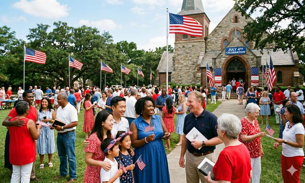
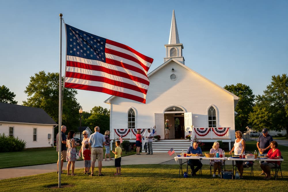
Use Real Photos and Real Language (Not Stock Church Vibes)
If you want to attract church visitors online, authenticity matters.
- Use real photos of your church and your people
- Avoid generic stock images
- Write in your church’s real voice (not overly polished or robotic copy)
People don’t connect with buildings. They connect with people.
Your website should feel like a preview of the real Sunday experience—not a marketing brochure.
Make Your Website Answer First-Time Guest Questions
Great church websites remove uncertainty.
Think about what a first-time guest is wondering:
- What should I wear?
- Where do I park?
- How long is the service?
- What about my kids?
- What’s the worship style?
- What kind of preaching should I expect?
If your website answers these clearly, you’re already practicing excellent church website best practices—and making it far more likely someone will actually show up.
Common Church Website Mistakes to Avoid
Here are a few issues that quietly hurt churches trying to attract visitors online:
Buried service times
Your service time and location should be front and center on your homepage.
Outdated location information
If your church has moved, make sure your:
- Website
- Google Business profile
- Map links
…are all updated. Nothing kills trust faster than showing up at the wrong address.
Insider language
Names like “Rooted,” “Fuse,” or “Onward” mean something to your members—but not to new visitors (or search engines).
Instead:
- “Fuse: Our Student Ministry for Middle & High School”
- “Rooted: A Discipleship Pathway for New Believers”
Clear always beats clever—especially for church website SEO.
Want to improve your church website without starting from scratch? Start with small, intentional changes that make your site clearer, faster, and more welcoming.
Use Simple Analytics to Improve Your Church Website
You don’t have to guess how people use your site.
Free tools like Microsoft Clarity can show you:
- Which pages people visit
- Where they click
- Where they get stuck
- How long they stay
This helps you make smarter decisions about your church website design and content—based on real behavior, not assumptions.
Turn Sermons into Ongoing Website Content
Your church already creates content every week: sermons. Use a tool like Sermon Shots to edit the message into bite-sized clips that are easy to share. Repurposing them for further teaching moments will help amplify the message and reach a wider audience.
Use them:
- Post sermons or clips on your website
- Upload them to YouTube (with good titles and descriptions)
- Share clips on social media
- Add sermon content to blog posts or resources
This helps:
- Keep your website fresh
- Improve church SEO over time
- Build trust with potential visitors
- Extend the reach of your teaching
Consistency matters more than perfection here.
Make Online Giving Easy to Find
Even for first-time visitors, generosity should be simple.
One of the most overlooked church website tips:
- Put your Give button in the top navigation
- Keep it visible on every page
- Don’t make people hunt for it
Fewer clicks = more completed gifts.
Why Church Website Growth Takes Time
If you’re serious about how to attract church visitors online, remember this:
Your website is more like a gym membership than a light switch.
- You don’t get results from one workout
- You don’t grow traffic from one blog post
- Momentum comes from consistent, patient effort
Keep improving. Keep publishing. Keep clarifying your message.
Over time, your church website becomes a powerful outreach tool.
Your Church Website Is a Ministry Tool
Your website isn’t just a tech project—it’s a pastoral tool.
Here are a few lesser-known functions of your church website:
- Welcomes people before they arrive
- Reduces fear and uncertainty
- Builds trust
- Helps people take their first step toward your church
And the best part? You don’t need a full redesign to start. Small, intentional improvements using these church website best practices can make a big difference.
Download "Building an Awesome Church Website" today.
Sign Up for Product Updates

Chris Dunagan is a marketing strategist focused on church tech and digital engagement. He helps churches grow through SEO, email campaigns, and tools like Tithely and Breeze ChMS, with an emphasis on online giving, content strategy, and digital outreach.
Your church website is no longer just a place to post service times. Today, it’s your online front door, and for many people, it’s the very first impression they’ll ever have of your church.
If you’re wondering how to attract church visitors online, the answer starts here: your website.
In a recent conversation with Kirk Deis (aka the “Digital Doctor” and Director of Demand Gen at Tithely), we broke down practical church website best practices that any church can implement—without a full redesign, a huge budget, or a tech team.
Whether you’re improving an existing site or planning your next update, these church website tips will help you turn more online visitors into in-person guests.
Watch the whole conversation on the Tithely YouTube Channel
Why Church Websites Matter More Than Ever
When someone moves to a new city or starts searching for a church, they usually don’t ask a neighbor first. They:
- Google “church near me”
- Check reviews
- Click a few church websites
- Decide which one feels welcoming and clear
That means your website is doing real ministry work before anyone ever walks through your doors.
A great church website:
- Builds trust
- Answers questions
- Reduces anxiety for first-time guests
- Makes the next step obvious
Design for Mobile First (Because That’s Where People Are)
One of the most important church website best practices today is a mobile-friendly design.
Most people will visit your site on their phone, not a desktop computer.
Here’s a simple test:
Open your church website on your phone.
In 5 seconds, can you find:
- Service times?
- Your location?
- What to do next?
If text is cut off, buttons are hard to tap, or navigation feels confusing, your church website design needs work.
Tip: You don’t need to be a developer. If it feels hard to use on your phone, your visitors feel that too.
Simplify Your Homepage for Clarity
A common mistake with church websites is trying to say everything on the homepage.
Too many options = decision paralysis.
Instead, your homepage should focus on just a few clear actions:
- Visit us this Sunday (time + location)
- Learn more about the church
- Give online
This is a core principle of effective church website design:
👉 Guide people to the next step instead of overwhelming them with choices.
Use Real Photos and Real Language (Not Stock Church Vibes)
If you want to attract church visitors online, authenticity matters.
- Use real photos of your church and your people
- Avoid generic stock images
- Write in your church’s real voice (not overly polished or robotic copy)
People don’t connect with buildings. They connect with people.
Your website should feel like a preview of the real Sunday experience—not a marketing brochure.
Make Your Website Answer First-Time Guest Questions
Great church websites remove uncertainty.
Think about what a first-time guest is wondering:
- What should I wear?
- Where do I park?
- How long is the service?
- What about my kids?
- What’s the worship style?
- What kind of preaching should I expect?
If your website answers these clearly, you’re already practicing excellent church website best practices—and making it far more likely someone will actually show up.
Common Church Website Mistakes to Avoid
Here are a few issues that quietly hurt churches trying to attract visitors online:
Buried service times
Your service time and location should be front and center on your homepage.
Outdated location information
If your church has moved, make sure your:
- Website
- Google Business profile
- Map links
…are all updated. Nothing kills trust faster than showing up at the wrong address.
Insider language
Names like “Rooted,” “Fuse,” or “Onward” mean something to your members—but not to new visitors (or search engines).
Instead:
- “Fuse: Our Student Ministry for Middle & High School”
- “Rooted: A Discipleship Pathway for New Believers”
Clear always beats clever—especially for church website SEO.
Want to improve your church website without starting from scratch? Start with small, intentional changes that make your site clearer, faster, and more welcoming.
Use Simple Analytics to Improve Your Church Website
You don’t have to guess how people use your site.
Free tools like Microsoft Clarity can show you:
- Which pages people visit
- Where they click
- Where they get stuck
- How long they stay
This helps you make smarter decisions about your church website design and content—based on real behavior, not assumptions.
Turn Sermons into Ongoing Website Content
Your church already creates content every week: sermons. Use a tool like Sermon Shots to edit the message into bite-sized clips that are easy to share. Repurposing them for further teaching moments will help amplify the message and reach a wider audience.
Use them:
- Post sermons or clips on your website
- Upload them to YouTube (with good titles and descriptions)
- Share clips on social media
- Add sermon content to blog posts or resources
This helps:
- Keep your website fresh
- Improve church SEO over time
- Build trust with potential visitors
- Extend the reach of your teaching
Consistency matters more than perfection here.
Make Online Giving Easy to Find
Even for first-time visitors, generosity should be simple.
One of the most overlooked church website tips:
- Put your Give button in the top navigation
- Keep it visible on every page
- Don’t make people hunt for it
Fewer clicks = more completed gifts.
Why Church Website Growth Takes Time
If you’re serious about how to attract church visitors online, remember this:
Your website is more like a gym membership than a light switch.
- You don’t get results from one workout
- You don’t grow traffic from one blog post
- Momentum comes from consistent, patient effort
Keep improving. Keep publishing. Keep clarifying your message.
Over time, your church website becomes a powerful outreach tool.
Your Church Website Is a Ministry Tool
Your website isn’t just a tech project—it’s a pastoral tool.
Here are a few lesser-known functions of your church website:
- Welcomes people before they arrive
- Reduces fear and uncertainty
- Builds trust
- Helps people take their first step toward your church
And the best part? You don’t need a full redesign to start. Small, intentional improvements using these church website best practices can make a big difference.
Download "Building an Awesome Church Website" today.
podcast transcript
Chris Dunagan is a marketing strategist focused on church tech and digital engagement. He helps churches grow through SEO, email campaigns, and tools like Tithely and Breeze ChMS, with an emphasis on online giving, content strategy, and digital outreach.
Your church website is no longer just a place to post service times. Today, it’s your online front door, and for many people, it’s the very first impression they’ll ever have of your church.
If you’re wondering how to attract church visitors online, the answer starts here: your website.
In a recent conversation with Kirk Deis (aka the “Digital Doctor” and Director of Demand Gen at Tithely), we broke down practical church website best practices that any church can implement—without a full redesign, a huge budget, or a tech team.
Whether you’re improving an existing site or planning your next update, these church website tips will help you turn more online visitors into in-person guests.
Watch the whole conversation on the Tithely YouTube Channel
Why Church Websites Matter More Than Ever
When someone moves to a new city or starts searching for a church, they usually don’t ask a neighbor first. They:
- Google “church near me”
- Check reviews
- Click a few church websites
- Decide which one feels welcoming and clear
That means your website is doing real ministry work before anyone ever walks through your doors.
A great church website:
- Builds trust
- Answers questions
- Reduces anxiety for first-time guests
- Makes the next step obvious
Design for Mobile First (Because That’s Where People Are)
One of the most important church website best practices today is a mobile-friendly design.
Most people will visit your site on their phone, not a desktop computer.
Here’s a simple test:
Open your church website on your phone.
In 5 seconds, can you find:
- Service times?
- Your location?
- What to do next?
If text is cut off, buttons are hard to tap, or navigation feels confusing, your church website design needs work.
Tip: You don’t need to be a developer. If it feels hard to use on your phone, your visitors feel that too.
Simplify Your Homepage for Clarity
A common mistake with church websites is trying to say everything on the homepage.
Too many options = decision paralysis.
Instead, your homepage should focus on just a few clear actions:
- Visit us this Sunday (time + location)
- Learn more about the church
- Give online
This is a core principle of effective church website design:
👉 Guide people to the next step instead of overwhelming them with choices.
Use Real Photos and Real Language (Not Stock Church Vibes)
If you want to attract church visitors online, authenticity matters.
- Use real photos of your church and your people
- Avoid generic stock images
- Write in your church’s real voice (not overly polished or robotic copy)
People don’t connect with buildings. They connect with people.
Your website should feel like a preview of the real Sunday experience—not a marketing brochure.
Make Your Website Answer First-Time Guest Questions
Great church websites remove uncertainty.
Think about what a first-time guest is wondering:
- What should I wear?
- Where do I park?
- How long is the service?
- What about my kids?
- What’s the worship style?
- What kind of preaching should I expect?
If your website answers these clearly, you’re already practicing excellent church website best practices—and making it far more likely someone will actually show up.
Common Church Website Mistakes to Avoid
Here are a few issues that quietly hurt churches trying to attract visitors online:
Buried service times
Your service time and location should be front and center on your homepage.
Outdated location information
If your church has moved, make sure your:
- Website
- Google Business profile
- Map links
…are all updated. Nothing kills trust faster than showing up at the wrong address.
Insider language
Names like “Rooted,” “Fuse,” or “Onward” mean something to your members—but not to new visitors (or search engines).
Instead:
- “Fuse: Our Student Ministry for Middle & High School”
- “Rooted: A Discipleship Pathway for New Believers”
Clear always beats clever—especially for church website SEO.
Want to improve your church website without starting from scratch? Start with small, intentional changes that make your site clearer, faster, and more welcoming.
Use Simple Analytics to Improve Your Church Website
You don’t have to guess how people use your site.
Free tools like Microsoft Clarity can show you:
- Which pages people visit
- Where they click
- Where they get stuck
- How long they stay
This helps you make smarter decisions about your church website design and content—based on real behavior, not assumptions.
Turn Sermons into Ongoing Website Content
Your church already creates content every week: sermons. Use a tool like Sermon Shots to edit the message into bite-sized clips that are easy to share. Repurposing them for further teaching moments will help amplify the message and reach a wider audience.
Use them:
- Post sermons or clips on your website
- Upload them to YouTube (with good titles and descriptions)
- Share clips on social media
- Add sermon content to blog posts or resources
This helps:
- Keep your website fresh
- Improve church SEO over time
- Build trust with potential visitors
- Extend the reach of your teaching
Consistency matters more than perfection here.
Make Online Giving Easy to Find
Even for first-time visitors, generosity should be simple.
One of the most overlooked church website tips:
- Put your Give button in the top navigation
- Keep it visible on every page
- Don’t make people hunt for it
Fewer clicks = more completed gifts.
Why Church Website Growth Takes Time
If you’re serious about how to attract church visitors online, remember this:
Your website is more like a gym membership than a light switch.
- You don’t get results from one workout
- You don’t grow traffic from one blog post
- Momentum comes from consistent, patient effort
Keep improving. Keep publishing. Keep clarifying your message.
Over time, your church website becomes a powerful outreach tool.
Your Church Website Is a Ministry Tool
Your website isn’t just a tech project—it’s a pastoral tool.
Here are a few lesser-known functions of your church website:
- Welcomes people before they arrive
- Reduces fear and uncertainty
- Builds trust
- Helps people take their first step toward your church
And the best part? You don’t need a full redesign to start. Small, intentional improvements using these church website best practices can make a big difference.
Download "Building an Awesome Church Website" today.
VIDEO transcript
Your church website is no longer just a place to post service times. Today, it’s your online front door, and for many people, it’s the very first impression they’ll ever have of your church.
If you’re wondering how to attract church visitors online, the answer starts here: your website.
In a recent conversation with Kirk Deis (aka the “Digital Doctor” and Director of Demand Gen at Tithely), we broke down practical church website best practices that any church can implement—without a full redesign, a huge budget, or a tech team.
Whether you’re improving an existing site or planning your next update, these church website tips will help you turn more online visitors into in-person guests.
Watch the whole conversation on the Tithely YouTube Channel
Why Church Websites Matter More Than Ever
When someone moves to a new city or starts searching for a church, they usually don’t ask a neighbor first. They:
- Google “church near me”
- Check reviews
- Click a few church websites
- Decide which one feels welcoming and clear
That means your website is doing real ministry work before anyone ever walks through your doors.
A great church website:
- Builds trust
- Answers questions
- Reduces anxiety for first-time guests
- Makes the next step obvious
Design for Mobile First (Because That’s Where People Are)
One of the most important church website best practices today is a mobile-friendly design.
Most people will visit your site on their phone, not a desktop computer.
Here’s a simple test:
Open your church website on your phone.
In 5 seconds, can you find:
- Service times?
- Your location?
- What to do next?
If text is cut off, buttons are hard to tap, or navigation feels confusing, your church website design needs work.
Tip: You don’t need to be a developer. If it feels hard to use on your phone, your visitors feel that too.
Simplify Your Homepage for Clarity
A common mistake with church websites is trying to say everything on the homepage.
Too many options = decision paralysis.
Instead, your homepage should focus on just a few clear actions:
- Visit us this Sunday (time + location)
- Learn more about the church
- Give online
This is a core principle of effective church website design:
👉 Guide people to the next step instead of overwhelming them with choices.
Use Real Photos and Real Language (Not Stock Church Vibes)
If you want to attract church visitors online, authenticity matters.
- Use real photos of your church and your people
- Avoid generic stock images
- Write in your church’s real voice (not overly polished or robotic copy)
People don’t connect with buildings. They connect with people.
Your website should feel like a preview of the real Sunday experience—not a marketing brochure.
Make Your Website Answer First-Time Guest Questions
Great church websites remove uncertainty.
Think about what a first-time guest is wondering:
- What should I wear?
- Where do I park?
- How long is the service?
- What about my kids?
- What’s the worship style?
- What kind of preaching should I expect?
If your website answers these clearly, you’re already practicing excellent church website best practices—and making it far more likely someone will actually show up.
Common Church Website Mistakes to Avoid
Here are a few issues that quietly hurt churches trying to attract visitors online:
Buried service times
Your service time and location should be front and center on your homepage.
Outdated location information
If your church has moved, make sure your:
- Website
- Google Business profile
- Map links
…are all updated. Nothing kills trust faster than showing up at the wrong address.
Insider language
Names like “Rooted,” “Fuse,” or “Onward” mean something to your members—but not to new visitors (or search engines).
Instead:
- “Fuse: Our Student Ministry for Middle & High School”
- “Rooted: A Discipleship Pathway for New Believers”
Clear always beats clever—especially for church website SEO.
Want to improve your church website without starting from scratch? Start with small, intentional changes that make your site clearer, faster, and more welcoming.
Use Simple Analytics to Improve Your Church Website
You don’t have to guess how people use your site.
Free tools like Microsoft Clarity can show you:
- Which pages people visit
- Where they click
- Where they get stuck
- How long they stay
This helps you make smarter decisions about your church website design and content—based on real behavior, not assumptions.
Turn Sermons into Ongoing Website Content
Your church already creates content every week: sermons. Use a tool like Sermon Shots to edit the message into bite-sized clips that are easy to share. Repurposing them for further teaching moments will help amplify the message and reach a wider audience.
Use them:
- Post sermons or clips on your website
- Upload them to YouTube (with good titles and descriptions)
- Share clips on social media
- Add sermon content to blog posts or resources
This helps:
- Keep your website fresh
- Improve church SEO over time
- Build trust with potential visitors
- Extend the reach of your teaching
Consistency matters more than perfection here.
Make Online Giving Easy to Find
Even for first-time visitors, generosity should be simple.
One of the most overlooked church website tips:
- Put your Give button in the top navigation
- Keep it visible on every page
- Don’t make people hunt for it
Fewer clicks = more completed gifts.
Why Church Website Growth Takes Time
If you’re serious about how to attract church visitors online, remember this:
Your website is more like a gym membership than a light switch.
- You don’t get results from one workout
- You don’t grow traffic from one blog post
- Momentum comes from consistent, patient effort
Keep improving. Keep publishing. Keep clarifying your message.
Over time, your church website becomes a powerful outreach tool.
Your Church Website Is a Ministry Tool
Your website isn’t just a tech project—it’s a pastoral tool.
Here are a few lesser-known functions of your church website:
- Welcomes people before they arrive
- Reduces fear and uncertainty
- Builds trust
- Helps people take their first step toward your church
And the best part? You don’t need a full redesign to start. Small, intentional improvements using these church website best practices can make a big difference.
Download "Building an Awesome Church Website" today.
Sign Up for Product Updates
Chris Dunagan is a marketing strategist focused on church tech and digital engagement. He helps churches grow through SEO, email campaigns, and tools like Tithely and Breeze ChMS, with an emphasis on online giving, content strategy, and digital outreach.

You Might Also Like
More Resources

From increasing giving, managing your congregation, and engaging your church, our collection of resources will keep you up-to-date on the latest church and ministry trends.
Free Resources