Best Church Websites for 2026: Designs That Inspire & Engage
Churches should prioritize their online presence. Here is a collection of inspiring and innovative examples of exceptionally effective church websites.

TLDR; What Makes a Great Church Website?
After looking over a few of our favorite websites, we ended up with a few notable takeaways on what makes a church website great.
- Church websites should be easy to navigate. Visitors don’t want to have to think too hard to find what they’re looking for. They want a simple, intuitive experience.
- Great church websites give visitors a way to respond. The goal of a website is to guide visitors to another touchpoint, whether that’s to visit on Sunday morning, sign up for an email list, or to listen to a sermon.
- Church websites should be nice to look at! Aesthetics are important, and you’ll want a website that looks contemporary, clean, and graphically interesting.
Table of Contents
Why Your Church Needs an Outstanding Website
Best Church Websites of 2026
Key Features That Make a Great Church Website
Common Mistakes Churches Make On Their Website
Conclusion
Why Your Church Needs an Outstanding Website
More than ever, your church website is a critical touchpoint for members, visitors, and seekers.
Your site is not only a reflection of who you are as a church. It’s also an opportunity to engage visitors, call them to action, and provide life-giving resources (such as sermons and livestreaming).
But as anyone who has ever attempted to build a church website has discovered, it’s not all that simple. To build a site from complete scratch, you need knowledge of coding and design at the very least.
Plus, visitors may have a range of goals when they come to your site. Are they looking up basic contact info? Are they interested in the most recent sermon? Or are they wanting to give money to support your group?
In short, creating a great church website is a tall order.
The best way to create an effective site? “Learn by example,” they say (After all, isn’t that how Jesus taught the disciples?)
In the following article, we’re taking a look at great examples of church websites, and why we think they’re exceptionally effective, engaging, and just plain cool to look at.
Centralia Bible Baptist Church
🌍 Website: centraliabbc.org
📍 Location: Centralia, Washington
Why This Website Stands Out:
Stunning images of the surrounding landscape are the perfect background for simple, thoughtful homepage navigation.
Key Features:
- Beautiful above-the-fold graphic carousel — They overlaid text on the graphic to make it clear what they’re all about.
- Immediate information — As soon as visitors scroll down from the above-the-fold graphic, they see clearly displayed service times.
- Robust sermon series page — CBBC makes it easy to access their teaching on a detailed sermon series page.

Salt Creek Baptist Church
🌍 Website: saltcreekchurch.org
📍 Location: Dallas, Orego
Why This Website Stands Out:
Salt Creek may have been around since the early 1900’s, but that doesn’t mean it’s stayed behind in terms of technology. They’ve got a fresh, clean website that helps visitors learn exactly who they are and how they can get involved at Salt Creek.
Key Features:
- Livestreaming — Salt Creek makes its live streaming option clear and accessible.
- Detailed sermons page — Clear, easy-to-access library of current messages on their “Sermons” page, conveniently located on the menu at the top of their homepage.
- Simplicity rules — A quick scroll through their homepage, and visitors can learn exactly who they are, what they teach, how to participate on Sundays, and other relevant news and updates.

beLoved City Church
🌍 Website: belovedchurch.ca
📍 Location: Nanaimo, British Columbia
Why This Website Stands Out:
With an immediate next step to "Get Connected," there's no doubt this church website was crafted with the church's vision in mind.
Key Features:
- Immediate CTA — “Get Connected” This immediately lets people know that this is a church that wants to connect–and gives visitors a way to do it.
- Simple sermon player — Easy-to-access sermon player right below the fold of the front homepage, directing visitors to their most recent messages.
- Newsletter sign-up — Site visitors who want to receive regular news from Beloved City Church can sign up for their newsletter emails at the bottom of the homepage.

SD.Church
🌍 Website: sd.church
📍 Location: San Diego, California
Why This Website Stands Out:
The homepage video on this site does an amazing job of showing you what to expect - a diverse and loving community committed to spiritual growth across all generations.
Key Features:
- Awesome site location pages — Their website does a great job at keeping this multisite church organized, with individual location pages that display staff members, home group information, and an events calendar.
- Social links — It’s more important than ever to build a church presence online, and SD.Church does an amazing job at linking site visitors to their YouTube page, Instagram account, and Livestreaming on Facebook.
- Clear navigation — It’s easy for site visitors to find their way around this website, with clear headers, buttons, and sections that make navigation a breeze.

Be The Church
🌍 Website: bethechurch.info
📍 Location: Atlanta, Georgia
Why This Website Stands Out:
Be The Church’s website is bold, intriguing, and action-oriented.
Key Features:
- Unique calls to action — Be The Church created an especially unique CTA that invites site visitors into a transformative experience.
- Awesome giving page — This website not only makes it easy to give, but provides site visitors with easy-to-understand instructions for giving online, with a text message, and more.

Unity of Dallas
🌍 Website: unitydallas.org
📍 Location: Dallas, Texas
Why This Website Stands Out:
Unity of Dallas is a Dallas-based church with a heavy emphasis on prayer and community.
Key Features:
- Upcoming Events — Unity of Dallas displays a clear events calendar on their homepage that makes it easy for site visitors to immediately see how they can get involved.
- Livestream Services — Unity of Dallas makes it simple to check out their livestream services from their homepage.
- Prayer Requests — One unique feature on the Unity of Dallas website is the prayer request feature. Site visitors are encouraged to submit prayer requests for any of their needs.

Jesus Christ Salt & Light Church
🌍 Website: jcslchurch.org
📍 Location: SeaTac, Washington
Why This Website Stands Out:
JCSL Church has a great, detailed church website that offers a ton of interesting information to site visitors.
Key Features:
- Blog — JCSL Church has an active blog that allows site visitors to get an intimate peek into the lives of church staff.
- Ministries Page — JCSL Church has a great ministries page that highlights the different opportunities they have to get involved and plugged into the community.
- “I’m New” — JCSL Church has an “I’m New” page that answers commonly asked questions about the church. This makes it fast and simple to understand the new visitor experience.

Transformation Church
🌍 Website: transformationchurchtbay.com
📍 Location: Thunder Bay, Ontario
Why This Website Stands Out:
Transformation Church is a Canada-based church that “ exists to make passionate disciples of Jesus Christ that will have a significant and lasting impact on the city of Thunder Bay and beyond.”
Key Features:
- Connection Card — A section that gives site visitors the opportunity to immediately connect with a contact information card.
- Get Involved — An awesome Get Involved section that helps site visitors immediately understand how they can get plugged in.
- Video Content — A feature video just for their Life Groups page, helping to give visitors immediate insight into the importance of getting involved in a small group.
All Peoples Gathering Church
🌍 Website: allpeoplesgathering.org
📍 Location: Milwaukee, Wisconsin
Why This Website Stands Out:
All Peoples Gathering Church is a Milwaukee-based church that emphasizes food justice and inclusivity.
Key Features:
All Peoples Gathering Church also happens to have a great church website. Here’s why we think it’s so effective.
- Events — An Events page that makes it easy to view their upcoming events in either a list or calendar format.
- App Download Section — The website also features an app download section that directs visitors to download their Church App and get connected right away.
- Search Bar — A search bar across the top of the page that makes it easy to look for a particular piece of information. A great add-on feature!

Impact Church
🌍 Website: impactcochrane.com
📍 Location: Cochrane, Alberta
Why This Website Stands Out:
A church plant in Alberta, Canada, Impact Church is a church that believes "that when the unconditional love, amazing grace, and powerful truths of Jesus impact our lives, we can become a thriving, irresistible church that can reach our world for Christ." With rich, inviting colors, and a solid countdown timer, they're building momentum to an amazing launch on April 13, 2025!
Key Features:
- Slick Menu transition — as you scroll beyond the fold, the menu choice styling updates to allow for maximum visibility down the page.
- Countdown timer — Helping build anticipation for their launch on April 13, 2025, the prominent countdown timer let’s guests know when the first service is going to be.
- Vision and Location — two important pieces of information are featured just below the fold.

Hope on the Beach Church
🌍 Website: hopeonthebeach.com
📍 Location: Santa Rosa Beach, Florida
Why This Website Stands Out:
Hope on the Beach Church's mission is to Awaken Hearts to Jesus, Every Day! Their site reflects their name and how they gather–on the beach!
Key Features:
- Plan your visit — a great way to engage first-time visitors! And, the CTA in the bottom right corner has social proof built in. It displays the current number of people who have planned a visit.
- Clear Mission and Vision — their about page is packed with loads of information that is organized in a visually appealing way.
- Events page — Current and upcoming events are clearly displayed alongside a “This Week’s Events” bulletin board. A simple, effective way to keep people informed.

B'Root Church
🌍 Website: brootchurch.org
📍 Location: Bitterroot Valley, Montana
Why This Website Stands Out:
"A church for all people, not just church people." B'Root Church is another great example of how a well-planned website can reflect the unique expression of a congregation.
Key Features:
- Minimal Top Navigation — Limiting choices on the homepage helps users defeat decision fatigue and allows them to choose the option which best fits their purpose for visiting the site.
- Simple Giving Page — The giving page is uncluttered, includes a clear and concise vision statement, “Your generosity is changing lives,” and allows one-click donations.
- Connect Form — Convenient opportunity for interested participants to get in touch with church leadership.

St. Marys' Metchosin
🌍 Website: stmarysmetchosin.ca
📍 Location: Victoria, BC
Why This Website Stands Out:
Showcases a clean design with easy navigation to various church programs and services.
Key Features:
- Simple, Welcoming Design – The homepage has a warm, inviting feel with natural imagery and minimal clutter, making it approachable for both regulars and first-time visitors.
- Clear Service & Contact Information – Service times, location, and contact details are prominently displayed on the homepage, reducing friction for newcomers trying to visit.
- Engaging Local Presence – The site emphasizes community involvement and history, including church events and outreach initiatives, which helps create a strong connection with the local area.
Christian Life Fellowship
🌍 Website: clfcr.com
📍 Location: Campbell River, BC
Why This Website Stands Out:
Features an engaging "About" page that effectively communicates the church's mission and values.
Key Features:
- Vibrant Visual Appeal – The homepage uses high-quality images and modern typography that reflects the energy and friendliness of the congregation.
- Easy Navigation & Mobile Optimization – With a sticky menu and clean layout, visitors can quickly access sermons, ministries, giving options, or learn what to expect when visiting. It’s also responsive and looks great on mobile.
- Clear Call-to-Action for Giving and Involvement – The giving platform is seamlessly integrated, and there are multiple invitations to connect, serve, or join small groups—making it easy to take the next step.

The Common Thread: Built with Tithe.ly
What do all of these sites have in common, other than the fact that they’re exceptionally effective?
They’re built with Tithely Sites.
Tithely makes it easy to build an awesome church website at a low cost and with minimal effort.
Offering livestream embedding, mobile-friendly site formats, digital event calendars, and more, Tithe.ly sites are a great option for anyone who wants to create a clean, effective, and dynamic website without a background in design or coding.
What Makes Church Websites Great?
A great church website does more than just provide basic information—it creates a welcoming, engaging, and user-friendly experience that reflects the church’s mission and values. Here’s what sets these top church websites apart:
User-Focused Design
A well-designed church website prioritizes ease of use with clear navigation and engaging layouts. Visitors should be able to quickly find essential information like service times, location, and upcoming events. A clean, intuitive menu helps first-time guests and long-time members easily navigate the site without confusion.
Engaging Visuals
First impressions matter, and high-quality images, videos, and motion effects help create an inviting digital presence. These websites use stunning photography of their church community, dynamic video backgrounds, and subtle motion effects to make their sites feel modern and immersive. Visual storytelling helps connect with visitors on an emotional level before they even step through the doors.
Mobile Optimization
With over 50% of web traffic coming from mobile devices, a responsive website design is a must-have. These top church websites ensure that every page, video, and call to action (CTA) is fully functional on smartphones and tablets. Mobile-friendly design improves accessibility and encourages engagement, whether someone is watching a sermon on the go or looking up service times before visiting.
Clear Calls to Action (CTAs)
Effective church websites make it easy for visitors to take their next step. Strategic CTAs like "Visit Us," "Give Online," or "Watch a Sermon" are prominently placed throughout the site, guiding users to meaningful actions. These CTAs create clear pathways for deeper involvement, whether it’s attending a service, supporting the church financially, or exploring past sermons.
Sermon & Media Libraries
A great church website isn’t just for Sunday—it serves as a resource throughout the week. Easy access to past sermons in video and audio formats allows members and new visitors to access church teachings anytime. A well-organized sermon archive, often with filtering options by date or topic, ensures that users can quickly find relevant content that speaks to them.
By combining these essential elements, the best church websites create an engaging online experience that facilitates connection, encourages involvement, and makes it easy for visitors to take the next step in their faith journey.
Common Church Website Mistakes to Avoid
A well-designed church website can be a powerful tool for outreach and engagement—but common mistakes can frustrate visitors and drive them away. Here are some pitfalls to watch out for:
Cluttered Homepage
A homepage overloaded with too much text and a lack of focus can overwhelm visitors. Instead of cramming everything onto the front page, a great church website should highlight key information—such as service times, upcoming events, and a welcoming message—while keeping the design clean and inviting.
Difficult Navigation
If important links are hard to find, users may get frustrated and leave. Poor navigation, unclear menus, and disorganized content make it difficult for visitors to locate essential information like sermons, giving options, or contact details. A clear, intuitive menu with well-labeled sections ensures a smooth browsing experience.
Not Mobile-Friendly
A site that doesn’t adapt to different screen sizes is a major issue. A lack of mobile optimization leads to slow loading times, broken layouts, and frustrating user experiences. A responsive design ensures the site works seamlessly on smartphones and tablets, and did we mention that over 50% of website traffic comes from mobile devices?
Missing or Confusing CTAs
If a website doesn’t have clear calls to action (CTAs), visitors won’t know what to do next. A great church website should include direct, easy-to-find CTAs like “Join Us This Sunday,” “Give Online,” or “Watch a Sermon” to guide visitors toward meaningful engagement.
Slow Loading Speed
A slow website not only frustrates users but also hurts SEO rankings. Large images, unoptimized code, or outdated hosting can lead to long load times. Since users expect pages to load within three seconds or less, optimizing performance through compressed images, caching, and fast hosting is essential.
By avoiding these common mistakes, churches can create a website that is welcoming, easy to navigate, and effective in connecting with both new visitors and longtime members.
Creating a Church Website That Welcomes and Engages
A great church website is more than just an online brochure—it’s a powerful tool for connection, outreach, and ministry. By focusing on clear navigation, engaging visuals, mobile optimization, strong calls to action, and accessible sermon libraries, your website can inspire visitors and help them take the next step in their faith journey.
At the same time, avoiding common pitfalls like cluttered layouts, confusing menus, slow loading speeds, and missing CTAs ensures that your website remains user-friendly and effective.
Your church’s online presence should reflect its heart and mission. Whether someone is searching for a new church home, looking for spiritual resources, or wanting to reconnect with their faith, your website can be a welcoming invitation to engage with your community. By making intentional design choices, you can create a website that not only looks great but also leads people closer to Christ—one click at a time.
Sign Up for Product Updates

TLDR; What Makes a Great Church Website?
After looking over a few of our favorite websites, we ended up with a few notable takeaways on what makes a church website great.
- Church websites should be easy to navigate. Visitors don’t want to have to think too hard to find what they’re looking for. They want a simple, intuitive experience.
- Great church websites give visitors a way to respond. The goal of a website is to guide visitors to another touchpoint, whether that’s to visit on Sunday morning, sign up for an email list, or to listen to a sermon.
- Church websites should be nice to look at! Aesthetics are important, and you’ll want a website that looks contemporary, clean, and graphically interesting.
Table of Contents
Why Your Church Needs an Outstanding Website
Best Church Websites of 2026
Key Features That Make a Great Church Website
Common Mistakes Churches Make On Their Website
Conclusion
Why Your Church Needs an Outstanding Website
More than ever, your church website is a critical touchpoint for members, visitors, and seekers.
Your site is not only a reflection of who you are as a church. It’s also an opportunity to engage visitors, call them to action, and provide life-giving resources (such as sermons and livestreaming).
But as anyone who has ever attempted to build a church website has discovered, it’s not all that simple. To build a site from complete scratch, you need knowledge of coding and design at the very least.
Plus, visitors may have a range of goals when they come to your site. Are they looking up basic contact info? Are they interested in the most recent sermon? Or are they wanting to give money to support your group?
In short, creating a great church website is a tall order.
The best way to create an effective site? “Learn by example,” they say (After all, isn’t that how Jesus taught the disciples?)
In the following article, we’re taking a look at great examples of church websites, and why we think they’re exceptionally effective, engaging, and just plain cool to look at.
Centralia Bible Baptist Church
🌍 Website: centraliabbc.org
📍 Location: Centralia, Washington
Why This Website Stands Out:
Stunning images of the surrounding landscape are the perfect background for simple, thoughtful homepage navigation.
Key Features:
- Beautiful above-the-fold graphic carousel — They overlaid text on the graphic to make it clear what they’re all about.
- Immediate information — As soon as visitors scroll down from the above-the-fold graphic, they see clearly displayed service times.
- Robust sermon series page — CBBC makes it easy to access their teaching on a detailed sermon series page.
Salt Creek Baptist Church
🌍 Website: saltcreekchurch.org
📍 Location: Dallas, Orego
Why This Website Stands Out:
Salt Creek may have been around since the early 1900’s, but that doesn’t mean it’s stayed behind in terms of technology. They’ve got a fresh, clean website that helps visitors learn exactly who they are and how they can get involved at Salt Creek.
Key Features:
- Livestreaming — Salt Creek makes its live streaming option clear and accessible.
- Detailed sermons page — Clear, easy-to-access library of current messages on their “Sermons” page, conveniently located on the menu at the top of their homepage.
- Simplicity rules — A quick scroll through their homepage, and visitors can learn exactly who they are, what they teach, how to participate on Sundays, and other relevant news and updates.
beLoved City Church
🌍 Website: belovedchurch.ca
📍 Location: Nanaimo, British Columbia
Why This Website Stands Out:
With an immediate next step to "Get Connected," there's no doubt this church website was crafted with the church's vision in mind.
Key Features:
- Immediate CTA — “Get Connected” This immediately lets people know that this is a church that wants to connect–and gives visitors a way to do it.
- Simple sermon player — Easy-to-access sermon player right below the fold of the front homepage, directing visitors to their most recent messages.
- Newsletter sign-up — Site visitors who want to receive regular news from Beloved City Church can sign up for their newsletter emails at the bottom of the homepage.
SD.Church
🌍 Website: sd.church
📍 Location: San Diego, California
Why This Website Stands Out:
The homepage video on this site does an amazing job of showing you what to expect - a diverse and loving community committed to spiritual growth across all generations.
Key Features:
- Awesome site location pages — Their website does a great job at keeping this multisite church organized, with individual location pages that display staff members, home group information, and an events calendar.
- Social links — It’s more important than ever to build a church presence online, and SD.Church does an amazing job at linking site visitors to their YouTube page, Instagram account, and Livestreaming on Facebook.
- Clear navigation — It’s easy for site visitors to find their way around this website, with clear headers, buttons, and sections that make navigation a breeze.
Be The Church
🌍 Website: bethechurch.info
📍 Location: Atlanta, Georgia
Why This Website Stands Out:
Be The Church’s website is bold, intriguing, and action-oriented.
Key Features:
- Unique calls to action — Be The Church created an especially unique CTA that invites site visitors into a transformative experience.
- Awesome giving page — This website not only makes it easy to give, but provides site visitors with easy-to-understand instructions for giving online, with a text message, and more.
Unity of Dallas
🌍 Website: unitydallas.org
📍 Location: Dallas, Texas
Why This Website Stands Out:
Unity of Dallas is a Dallas-based church with a heavy emphasis on prayer and community.
Key Features:
- Upcoming Events — Unity of Dallas displays a clear events calendar on their homepage that makes it easy for site visitors to immediately see how they can get involved.
- Livestream Services — Unity of Dallas makes it simple to check out their livestream services from their homepage.
- Prayer Requests — One unique feature on the Unity of Dallas website is the prayer request feature. Site visitors are encouraged to submit prayer requests for any of their needs.
Jesus Christ Salt & Light Church
🌍 Website: jcslchurch.org
📍 Location: SeaTac, Washington
Why This Website Stands Out:
JCSL Church has a great, detailed church website that offers a ton of interesting information to site visitors.
Key Features:
- Blog — JCSL Church has an active blog that allows site visitors to get an intimate peek into the lives of church staff.
- Ministries Page — JCSL Church has a great ministries page that highlights the different opportunities they have to get involved and plugged into the community.
- “I’m New” — JCSL Church has an “I’m New” page that answers commonly asked questions about the church. This makes it fast and simple to understand the new visitor experience.
Transformation Church
🌍 Website: transformationchurchtbay.com
📍 Location: Thunder Bay, Ontario
Why This Website Stands Out:
Transformation Church is a Canada-based church that “ exists to make passionate disciples of Jesus Christ that will have a significant and lasting impact on the city of Thunder Bay and beyond.”
Key Features:
- Connection Card — A section that gives site visitors the opportunity to immediately connect with a contact information card.
- Get Involved — An awesome Get Involved section that helps site visitors immediately understand how they can get plugged in.
- Video Content — A feature video just for their Life Groups page, helping to give visitors immediate insight into the importance of getting involved in a small group.
All Peoples Gathering Church
🌍 Website: allpeoplesgathering.org
📍 Location: Milwaukee, Wisconsin
Why This Website Stands Out:
All Peoples Gathering Church is a Milwaukee-based church that emphasizes food justice and inclusivity.
Key Features:
All Peoples Gathering Church also happens to have a great church website. Here’s why we think it’s so effective.
- Events — An Events page that makes it easy to view their upcoming events in either a list or calendar format.
- App Download Section — The website also features an app download section that directs visitors to download their Church App and get connected right away.
- Search Bar — A search bar across the top of the page that makes it easy to look for a particular piece of information. A great add-on feature!
Impact Church
🌍 Website: impactcochrane.com
📍 Location: Cochrane, Alberta
Why This Website Stands Out:
A church plant in Alberta, Canada, Impact Church is a church that believes "that when the unconditional love, amazing grace, and powerful truths of Jesus impact our lives, we can become a thriving, irresistible church that can reach our world for Christ." With rich, inviting colors, and a solid countdown timer, they're building momentum to an amazing launch on April 13, 2025!
Key Features:
- Slick Menu transition — as you scroll beyond the fold, the menu choice styling updates to allow for maximum visibility down the page.
- Countdown timer — Helping build anticipation for their launch on April 13, 2025, the prominent countdown timer let’s guests know when the first service is going to be.
- Vision and Location — two important pieces of information are featured just below the fold.
Hope on the Beach Church
🌍 Website: hopeonthebeach.com
📍 Location: Santa Rosa Beach, Florida
Why This Website Stands Out:
Hope on the Beach Church's mission is to Awaken Hearts to Jesus, Every Day! Their site reflects their name and how they gather–on the beach!
Key Features:
- Plan your visit — a great way to engage first-time visitors! And, the CTA in the bottom right corner has social proof built in. It displays the current number of people who have planned a visit.
- Clear Mission and Vision — their about page is packed with loads of information that is organized in a visually appealing way.
- Events page — Current and upcoming events are clearly displayed alongside a “This Week’s Events” bulletin board. A simple, effective way to keep people informed.
B'Root Church
🌍 Website: brootchurch.org
📍 Location: Bitterroot Valley, Montana
Why This Website Stands Out:
"A church for all people, not just church people." B'Root Church is another great example of how a well-planned website can reflect the unique expression of a congregation.
Key Features:
- Minimal Top Navigation — Limiting choices on the homepage helps users defeat decision fatigue and allows them to choose the option which best fits their purpose for visiting the site.
- Simple Giving Page — The giving page is uncluttered, includes a clear and concise vision statement, “Your generosity is changing lives,” and allows one-click donations.
- Connect Form — Convenient opportunity for interested participants to get in touch with church leadership.
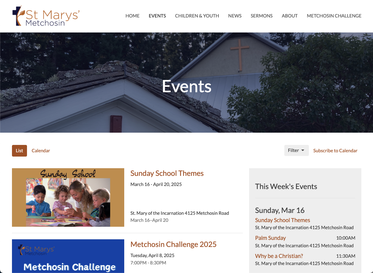
St. Marys' Metchosin
🌍 Website: stmarysmetchosin.ca
📍 Location: Victoria, BC
Why This Website Stands Out:
Showcases a clean design with easy navigation to various church programs and services.
Key Features:
- Simple, Welcoming Design – The homepage has a warm, inviting feel with natural imagery and minimal clutter, making it approachable for both regulars and first-time visitors.
- Clear Service & Contact Information – Service times, location, and contact details are prominently displayed on the homepage, reducing friction for newcomers trying to visit.
- Engaging Local Presence – The site emphasizes community involvement and history, including church events and outreach initiatives, which helps create a strong connection with the local area.
Christian Life Fellowship
🌍 Website: clfcr.com
📍 Location: Campbell River, BC
Why This Website Stands Out:
Features an engaging "About" page that effectively communicates the church's mission and values.
Key Features:
- Vibrant Visual Appeal – The homepage uses high-quality images and modern typography that reflects the energy and friendliness of the congregation.
- Easy Navigation & Mobile Optimization – With a sticky menu and clean layout, visitors can quickly access sermons, ministries, giving options, or learn what to expect when visiting. It’s also responsive and looks great on mobile.
- Clear Call-to-Action for Giving and Involvement – The giving platform is seamlessly integrated, and there are multiple invitations to connect, serve, or join small groups—making it easy to take the next step.
The Common Thread: Built with Tithe.ly
What do all of these sites have in common, other than the fact that they’re exceptionally effective?
They’re built with Tithely Sites.
Tithely makes it easy to build an awesome church website at a low cost and with minimal effort.
Offering livestream embedding, mobile-friendly site formats, digital event calendars, and more, Tithe.ly sites are a great option for anyone who wants to create a clean, effective, and dynamic website without a background in design or coding.
What Makes Church Websites Great?
A great church website does more than just provide basic information—it creates a welcoming, engaging, and user-friendly experience that reflects the church’s mission and values. Here’s what sets these top church websites apart:
User-Focused Design
A well-designed church website prioritizes ease of use with clear navigation and engaging layouts. Visitors should be able to quickly find essential information like service times, location, and upcoming events. A clean, intuitive menu helps first-time guests and long-time members easily navigate the site without confusion.
Engaging Visuals
First impressions matter, and high-quality images, videos, and motion effects help create an inviting digital presence. These websites use stunning photography of their church community, dynamic video backgrounds, and subtle motion effects to make their sites feel modern and immersive. Visual storytelling helps connect with visitors on an emotional level before they even step through the doors.
Mobile Optimization
With over 50% of web traffic coming from mobile devices, a responsive website design is a must-have. These top church websites ensure that every page, video, and call to action (CTA) is fully functional on smartphones and tablets. Mobile-friendly design improves accessibility and encourages engagement, whether someone is watching a sermon on the go or looking up service times before visiting.
Clear Calls to Action (CTAs)
Effective church websites make it easy for visitors to take their next step. Strategic CTAs like "Visit Us," "Give Online," or "Watch a Sermon" are prominently placed throughout the site, guiding users to meaningful actions. These CTAs create clear pathways for deeper involvement, whether it’s attending a service, supporting the church financially, or exploring past sermons.
Sermon & Media Libraries
A great church website isn’t just for Sunday—it serves as a resource throughout the week. Easy access to past sermons in video and audio formats allows members and new visitors to access church teachings anytime. A well-organized sermon archive, often with filtering options by date or topic, ensures that users can quickly find relevant content that speaks to them.
By combining these essential elements, the best church websites create an engaging online experience that facilitates connection, encourages involvement, and makes it easy for visitors to take the next step in their faith journey.
Common Church Website Mistakes to Avoid
A well-designed church website can be a powerful tool for outreach and engagement—but common mistakes can frustrate visitors and drive them away. Here are some pitfalls to watch out for:
Cluttered Homepage
A homepage overloaded with too much text and a lack of focus can overwhelm visitors. Instead of cramming everything onto the front page, a great church website should highlight key information—such as service times, upcoming events, and a welcoming message—while keeping the design clean and inviting.
Difficult Navigation
If important links are hard to find, users may get frustrated and leave. Poor navigation, unclear menus, and disorganized content make it difficult for visitors to locate essential information like sermons, giving options, or contact details. A clear, intuitive menu with well-labeled sections ensures a smooth browsing experience.
Not Mobile-Friendly
A site that doesn’t adapt to different screen sizes is a major issue. A lack of mobile optimization leads to slow loading times, broken layouts, and frustrating user experiences. A responsive design ensures the site works seamlessly on smartphones and tablets, and did we mention that over 50% of website traffic comes from mobile devices?
Missing or Confusing CTAs
If a website doesn’t have clear calls to action (CTAs), visitors won’t know what to do next. A great church website should include direct, easy-to-find CTAs like “Join Us This Sunday,” “Give Online,” or “Watch a Sermon” to guide visitors toward meaningful engagement.
Slow Loading Speed
A slow website not only frustrates users but also hurts SEO rankings. Large images, unoptimized code, or outdated hosting can lead to long load times. Since users expect pages to load within three seconds or less, optimizing performance through compressed images, caching, and fast hosting is essential.
By avoiding these common mistakes, churches can create a website that is welcoming, easy to navigate, and effective in connecting with both new visitors and longtime members.
Creating a Church Website That Welcomes and Engages
A great church website is more than just an online brochure—it’s a powerful tool for connection, outreach, and ministry. By focusing on clear navigation, engaging visuals, mobile optimization, strong calls to action, and accessible sermon libraries, your website can inspire visitors and help them take the next step in their faith journey.
At the same time, avoiding common pitfalls like cluttered layouts, confusing menus, slow loading speeds, and missing CTAs ensures that your website remains user-friendly and effective.
Your church’s online presence should reflect its heart and mission. Whether someone is searching for a new church home, looking for spiritual resources, or wanting to reconnect with their faith, your website can be a welcoming invitation to engage with your community. By making intentional design choices, you can create a website that not only looks great but also leads people closer to Christ—one click at a time.
podcast transcript
TLDR; What Makes a Great Church Website?
After looking over a few of our favorite websites, we ended up with a few notable takeaways on what makes a church website great.
- Church websites should be easy to navigate. Visitors don’t want to have to think too hard to find what they’re looking for. They want a simple, intuitive experience.
- Great church websites give visitors a way to respond. The goal of a website is to guide visitors to another touchpoint, whether that’s to visit on Sunday morning, sign up for an email list, or to listen to a sermon.
- Church websites should be nice to look at! Aesthetics are important, and you’ll want a website that looks contemporary, clean, and graphically interesting.
Table of Contents
Why Your Church Needs an Outstanding Website
Best Church Websites of 2026
Key Features That Make a Great Church Website
Common Mistakes Churches Make On Their Website
Conclusion
Why Your Church Needs an Outstanding Website
More than ever, your church website is a critical touchpoint for members, visitors, and seekers.
Your site is not only a reflection of who you are as a church. It’s also an opportunity to engage visitors, call them to action, and provide life-giving resources (such as sermons and livestreaming).
But as anyone who has ever attempted to build a church website has discovered, it’s not all that simple. To build a site from complete scratch, you need knowledge of coding and design at the very least.
Plus, visitors may have a range of goals when they come to your site. Are they looking up basic contact info? Are they interested in the most recent sermon? Or are they wanting to give money to support your group?
In short, creating a great church website is a tall order.
The best way to create an effective site? “Learn by example,” they say (After all, isn’t that how Jesus taught the disciples?)
In the following article, we’re taking a look at great examples of church websites, and why we think they’re exceptionally effective, engaging, and just plain cool to look at.
Centralia Bible Baptist Church
🌍 Website: centraliabbc.org
📍 Location: Centralia, Washington
Why This Website Stands Out:
Stunning images of the surrounding landscape are the perfect background for simple, thoughtful homepage navigation.
Key Features:
- Beautiful above-the-fold graphic carousel — They overlaid text on the graphic to make it clear what they’re all about.
- Immediate information — As soon as visitors scroll down from the above-the-fold graphic, they see clearly displayed service times.
- Robust sermon series page — CBBC makes it easy to access their teaching on a detailed sermon series page.
Salt Creek Baptist Church
🌍 Website: saltcreekchurch.org
📍 Location: Dallas, Orego
Why This Website Stands Out:
Salt Creek may have been around since the early 1900’s, but that doesn’t mean it’s stayed behind in terms of technology. They’ve got a fresh, clean website that helps visitors learn exactly who they are and how they can get involved at Salt Creek.
Key Features:
- Livestreaming — Salt Creek makes its live streaming option clear and accessible.
- Detailed sermons page — Clear, easy-to-access library of current messages on their “Sermons” page, conveniently located on the menu at the top of their homepage.
- Simplicity rules — A quick scroll through their homepage, and visitors can learn exactly who they are, what they teach, how to participate on Sundays, and other relevant news and updates.
beLoved City Church
🌍 Website: belovedchurch.ca
📍 Location: Nanaimo, British Columbia
Why This Website Stands Out:
With an immediate next step to "Get Connected," there's no doubt this church website was crafted with the church's vision in mind.
Key Features:
- Immediate CTA — “Get Connected” This immediately lets people know that this is a church that wants to connect–and gives visitors a way to do it.
- Simple sermon player — Easy-to-access sermon player right below the fold of the front homepage, directing visitors to their most recent messages.
- Newsletter sign-up — Site visitors who want to receive regular news from Beloved City Church can sign up for their newsletter emails at the bottom of the homepage.
SD.Church
🌍 Website: sd.church
📍 Location: San Diego, California
Why This Website Stands Out:
The homepage video on this site does an amazing job of showing you what to expect - a diverse and loving community committed to spiritual growth across all generations.
Key Features:
- Awesome site location pages — Their website does a great job at keeping this multisite church organized, with individual location pages that display staff members, home group information, and an events calendar.
- Social links — It’s more important than ever to build a church presence online, and SD.Church does an amazing job at linking site visitors to their YouTube page, Instagram account, and Livestreaming on Facebook.
- Clear navigation — It’s easy for site visitors to find their way around this website, with clear headers, buttons, and sections that make navigation a breeze.
Be The Church
🌍 Website: bethechurch.info
📍 Location: Atlanta, Georgia
Why This Website Stands Out:
Be The Church’s website is bold, intriguing, and action-oriented.
Key Features:
- Unique calls to action — Be The Church created an especially unique CTA that invites site visitors into a transformative experience.
- Awesome giving page — This website not only makes it easy to give, but provides site visitors with easy-to-understand instructions for giving online, with a text message, and more.
Unity of Dallas
🌍 Website: unitydallas.org
📍 Location: Dallas, Texas
Why This Website Stands Out:
Unity of Dallas is a Dallas-based church with a heavy emphasis on prayer and community.
Key Features:
- Upcoming Events — Unity of Dallas displays a clear events calendar on their homepage that makes it easy for site visitors to immediately see how they can get involved.
- Livestream Services — Unity of Dallas makes it simple to check out their livestream services from their homepage.
- Prayer Requests — One unique feature on the Unity of Dallas website is the prayer request feature. Site visitors are encouraged to submit prayer requests for any of their needs.
Jesus Christ Salt & Light Church
🌍 Website: jcslchurch.org
📍 Location: SeaTac, Washington
Why This Website Stands Out:
JCSL Church has a great, detailed church website that offers a ton of interesting information to site visitors.
Key Features:
- Blog — JCSL Church has an active blog that allows site visitors to get an intimate peek into the lives of church staff.
- Ministries Page — JCSL Church has a great ministries page that highlights the different opportunities they have to get involved and plugged into the community.
- “I’m New” — JCSL Church has an “I’m New” page that answers commonly asked questions about the church. This makes it fast and simple to understand the new visitor experience.
Transformation Church
🌍 Website: transformationchurchtbay.com
📍 Location: Thunder Bay, Ontario
Why This Website Stands Out:
Transformation Church is a Canada-based church that “ exists to make passionate disciples of Jesus Christ that will have a significant and lasting impact on the city of Thunder Bay and beyond.”
Key Features:
- Connection Card — A section that gives site visitors the opportunity to immediately connect with a contact information card.
- Get Involved — An awesome Get Involved section that helps site visitors immediately understand how they can get plugged in.
- Video Content — A feature video just for their Life Groups page, helping to give visitors immediate insight into the importance of getting involved in a small group.
All Peoples Gathering Church
🌍 Website: allpeoplesgathering.org
📍 Location: Milwaukee, Wisconsin
Why This Website Stands Out:
All Peoples Gathering Church is a Milwaukee-based church that emphasizes food justice and inclusivity.
Key Features:
All Peoples Gathering Church also happens to have a great church website. Here’s why we think it’s so effective.
- Events — An Events page that makes it easy to view their upcoming events in either a list or calendar format.
- App Download Section — The website also features an app download section that directs visitors to download their Church App and get connected right away.
- Search Bar — A search bar across the top of the page that makes it easy to look for a particular piece of information. A great add-on feature!
Impact Church
🌍 Website: impactcochrane.com
📍 Location: Cochrane, Alberta
Why This Website Stands Out:
A church plant in Alberta, Canada, Impact Church is a church that believes "that when the unconditional love, amazing grace, and powerful truths of Jesus impact our lives, we can become a thriving, irresistible church that can reach our world for Christ." With rich, inviting colors, and a solid countdown timer, they're building momentum to an amazing launch on April 13, 2025!
Key Features:
- Slick Menu transition — as you scroll beyond the fold, the menu choice styling updates to allow for maximum visibility down the page.
- Countdown timer — Helping build anticipation for their launch on April 13, 2025, the prominent countdown timer let’s guests know when the first service is going to be.
- Vision and Location — two important pieces of information are featured just below the fold.
Hope on the Beach Church
🌍 Website: hopeonthebeach.com
📍 Location: Santa Rosa Beach, Florida
Why This Website Stands Out:
Hope on the Beach Church's mission is to Awaken Hearts to Jesus, Every Day! Their site reflects their name and how they gather–on the beach!
Key Features:
- Plan your visit — a great way to engage first-time visitors! And, the CTA in the bottom right corner has social proof built in. It displays the current number of people who have planned a visit.
- Clear Mission and Vision — their about page is packed with loads of information that is organized in a visually appealing way.
- Events page — Current and upcoming events are clearly displayed alongside a “This Week’s Events” bulletin board. A simple, effective way to keep people informed.
B'Root Church
🌍 Website: brootchurch.org
📍 Location: Bitterroot Valley, Montana
Why This Website Stands Out:
"A church for all people, not just church people." B'Root Church is another great example of how a well-planned website can reflect the unique expression of a congregation.
Key Features:
- Minimal Top Navigation — Limiting choices on the homepage helps users defeat decision fatigue and allows them to choose the option which best fits their purpose for visiting the site.
- Simple Giving Page — The giving page is uncluttered, includes a clear and concise vision statement, “Your generosity is changing lives,” and allows one-click donations.
- Connect Form — Convenient opportunity for interested participants to get in touch with church leadership.
St. Marys' Metchosin
🌍 Website: stmarysmetchosin.ca
📍 Location: Victoria, BC
Why This Website Stands Out:
Showcases a clean design with easy navigation to various church programs and services.
Key Features:
- Simple, Welcoming Design – The homepage has a warm, inviting feel with natural imagery and minimal clutter, making it approachable for both regulars and first-time visitors.
- Clear Service & Contact Information – Service times, location, and contact details are prominently displayed on the homepage, reducing friction for newcomers trying to visit.
- Engaging Local Presence – The site emphasizes community involvement and history, including church events and outreach initiatives, which helps create a strong connection with the local area.
Christian Life Fellowship
🌍 Website: clfcr.com
📍 Location: Campbell River, BC
Why This Website Stands Out:
Features an engaging "About" page that effectively communicates the church's mission and values.
Key Features:
- Vibrant Visual Appeal – The homepage uses high-quality images and modern typography that reflects the energy and friendliness of the congregation.
- Easy Navigation & Mobile Optimization – With a sticky menu and clean layout, visitors can quickly access sermons, ministries, giving options, or learn what to expect when visiting. It’s also responsive and looks great on mobile.
- Clear Call-to-Action for Giving and Involvement – The giving platform is seamlessly integrated, and there are multiple invitations to connect, serve, or join small groups—making it easy to take the next step.
The Common Thread: Built with Tithe.ly
What do all of these sites have in common, other than the fact that they’re exceptionally effective?
They’re built with Tithely Sites.
Tithely makes it easy to build an awesome church website at a low cost and with minimal effort.
Offering livestream embedding, mobile-friendly site formats, digital event calendars, and more, Tithe.ly sites are a great option for anyone who wants to create a clean, effective, and dynamic website without a background in design or coding.
What Makes Church Websites Great?
A great church website does more than just provide basic information—it creates a welcoming, engaging, and user-friendly experience that reflects the church’s mission and values. Here’s what sets these top church websites apart:
User-Focused Design
A well-designed church website prioritizes ease of use with clear navigation and engaging layouts. Visitors should be able to quickly find essential information like service times, location, and upcoming events. A clean, intuitive menu helps first-time guests and long-time members easily navigate the site without confusion.
Engaging Visuals
First impressions matter, and high-quality images, videos, and motion effects help create an inviting digital presence. These websites use stunning photography of their church community, dynamic video backgrounds, and subtle motion effects to make their sites feel modern and immersive. Visual storytelling helps connect with visitors on an emotional level before they even step through the doors.
Mobile Optimization
With over 50% of web traffic coming from mobile devices, a responsive website design is a must-have. These top church websites ensure that every page, video, and call to action (CTA) is fully functional on smartphones and tablets. Mobile-friendly design improves accessibility and encourages engagement, whether someone is watching a sermon on the go or looking up service times before visiting.
Clear Calls to Action (CTAs)
Effective church websites make it easy for visitors to take their next step. Strategic CTAs like "Visit Us," "Give Online," or "Watch a Sermon" are prominently placed throughout the site, guiding users to meaningful actions. These CTAs create clear pathways for deeper involvement, whether it’s attending a service, supporting the church financially, or exploring past sermons.
Sermon & Media Libraries
A great church website isn’t just for Sunday—it serves as a resource throughout the week. Easy access to past sermons in video and audio formats allows members and new visitors to access church teachings anytime. A well-organized sermon archive, often with filtering options by date or topic, ensures that users can quickly find relevant content that speaks to them.
By combining these essential elements, the best church websites create an engaging online experience that facilitates connection, encourages involvement, and makes it easy for visitors to take the next step in their faith journey.
Common Church Website Mistakes to Avoid
A well-designed church website can be a powerful tool for outreach and engagement—but common mistakes can frustrate visitors and drive them away. Here are some pitfalls to watch out for:
Cluttered Homepage
A homepage overloaded with too much text and a lack of focus can overwhelm visitors. Instead of cramming everything onto the front page, a great church website should highlight key information—such as service times, upcoming events, and a welcoming message—while keeping the design clean and inviting.
Difficult Navigation
If important links are hard to find, users may get frustrated and leave. Poor navigation, unclear menus, and disorganized content make it difficult for visitors to locate essential information like sermons, giving options, or contact details. A clear, intuitive menu with well-labeled sections ensures a smooth browsing experience.
Not Mobile-Friendly
A site that doesn’t adapt to different screen sizes is a major issue. A lack of mobile optimization leads to slow loading times, broken layouts, and frustrating user experiences. A responsive design ensures the site works seamlessly on smartphones and tablets, and did we mention that over 50% of website traffic comes from mobile devices?
Missing or Confusing CTAs
If a website doesn’t have clear calls to action (CTAs), visitors won’t know what to do next. A great church website should include direct, easy-to-find CTAs like “Join Us This Sunday,” “Give Online,” or “Watch a Sermon” to guide visitors toward meaningful engagement.
Slow Loading Speed
A slow website not only frustrates users but also hurts SEO rankings. Large images, unoptimized code, or outdated hosting can lead to long load times. Since users expect pages to load within three seconds or less, optimizing performance through compressed images, caching, and fast hosting is essential.
By avoiding these common mistakes, churches can create a website that is welcoming, easy to navigate, and effective in connecting with both new visitors and longtime members.
Creating a Church Website That Welcomes and Engages
A great church website is more than just an online brochure—it’s a powerful tool for connection, outreach, and ministry. By focusing on clear navigation, engaging visuals, mobile optimization, strong calls to action, and accessible sermon libraries, your website can inspire visitors and help them take the next step in their faith journey.
At the same time, avoiding common pitfalls like cluttered layouts, confusing menus, slow loading speeds, and missing CTAs ensures that your website remains user-friendly and effective.
Your church’s online presence should reflect its heart and mission. Whether someone is searching for a new church home, looking for spiritual resources, or wanting to reconnect with their faith, your website can be a welcoming invitation to engage with your community. By making intentional design choices, you can create a website that not only looks great but also leads people closer to Christ—one click at a time.
VIDEO transcript
TLDR; What Makes a Great Church Website?
After looking over a few of our favorite websites, we ended up with a few notable takeaways on what makes a church website great.
- Church websites should be easy to navigate. Visitors don’t want to have to think too hard to find what they’re looking for. They want a simple, intuitive experience.
- Great church websites give visitors a way to respond. The goal of a website is to guide visitors to another touchpoint, whether that’s to visit on Sunday morning, sign up for an email list, or to listen to a sermon.
- Church websites should be nice to look at! Aesthetics are important, and you’ll want a website that looks contemporary, clean, and graphically interesting.
Table of Contents
Why Your Church Needs an Outstanding Website
Best Church Websites of 2026
Key Features That Make a Great Church Website
Common Mistakes Churches Make On Their Website
Conclusion
Why Your Church Needs an Outstanding Website
More than ever, your church website is a critical touchpoint for members, visitors, and seekers.
Your site is not only a reflection of who you are as a church. It’s also an opportunity to engage visitors, call them to action, and provide life-giving resources (such as sermons and livestreaming).
But as anyone who has ever attempted to build a church website has discovered, it’s not all that simple. To build a site from complete scratch, you need knowledge of coding and design at the very least.
Plus, visitors may have a range of goals when they come to your site. Are they looking up basic contact info? Are they interested in the most recent sermon? Or are they wanting to give money to support your group?
In short, creating a great church website is a tall order.
The best way to create an effective site? “Learn by example,” they say (After all, isn’t that how Jesus taught the disciples?)
In the following article, we’re taking a look at great examples of church websites, and why we think they’re exceptionally effective, engaging, and just plain cool to look at.
Centralia Bible Baptist Church
🌍 Website: centraliabbc.org
📍 Location: Centralia, Washington
Why This Website Stands Out:
Stunning images of the surrounding landscape are the perfect background for simple, thoughtful homepage navigation.
Key Features:
- Beautiful above-the-fold graphic carousel — They overlaid text on the graphic to make it clear what they’re all about.
- Immediate information — As soon as visitors scroll down from the above-the-fold graphic, they see clearly displayed service times.
- Robust sermon series page — CBBC makes it easy to access their teaching on a detailed sermon series page.
Salt Creek Baptist Church
🌍 Website: saltcreekchurch.org
📍 Location: Dallas, Orego
Why This Website Stands Out:
Salt Creek may have been around since the early 1900’s, but that doesn’t mean it’s stayed behind in terms of technology. They’ve got a fresh, clean website that helps visitors learn exactly who they are and how they can get involved at Salt Creek.
Key Features:
- Livestreaming — Salt Creek makes its live streaming option clear and accessible.
- Detailed sermons page — Clear, easy-to-access library of current messages on their “Sermons” page, conveniently located on the menu at the top of their homepage.
- Simplicity rules — A quick scroll through their homepage, and visitors can learn exactly who they are, what they teach, how to participate on Sundays, and other relevant news and updates.
beLoved City Church
🌍 Website: belovedchurch.ca
📍 Location: Nanaimo, British Columbia
Why This Website Stands Out:
With an immediate next step to "Get Connected," there's no doubt this church website was crafted with the church's vision in mind.
Key Features:
- Immediate CTA — “Get Connected” This immediately lets people know that this is a church that wants to connect–and gives visitors a way to do it.
- Simple sermon player — Easy-to-access sermon player right below the fold of the front homepage, directing visitors to their most recent messages.
- Newsletter sign-up — Site visitors who want to receive regular news from Beloved City Church can sign up for their newsletter emails at the bottom of the homepage.
SD.Church
🌍 Website: sd.church
📍 Location: San Diego, California
Why This Website Stands Out:
The homepage video on this site does an amazing job of showing you what to expect - a diverse and loving community committed to spiritual growth across all generations.
Key Features:
- Awesome site location pages — Their website does a great job at keeping this multisite church organized, with individual location pages that display staff members, home group information, and an events calendar.
- Social links — It’s more important than ever to build a church presence online, and SD.Church does an amazing job at linking site visitors to their YouTube page, Instagram account, and Livestreaming on Facebook.
- Clear navigation — It’s easy for site visitors to find their way around this website, with clear headers, buttons, and sections that make navigation a breeze.
Be The Church
🌍 Website: bethechurch.info
📍 Location: Atlanta, Georgia
Why This Website Stands Out:
Be The Church’s website is bold, intriguing, and action-oriented.
Key Features:
- Unique calls to action — Be The Church created an especially unique CTA that invites site visitors into a transformative experience.
- Awesome giving page — This website not only makes it easy to give, but provides site visitors with easy-to-understand instructions for giving online, with a text message, and more.
Unity of Dallas
🌍 Website: unitydallas.org
📍 Location: Dallas, Texas
Why This Website Stands Out:
Unity of Dallas is a Dallas-based church with a heavy emphasis on prayer and community.
Key Features:
- Upcoming Events — Unity of Dallas displays a clear events calendar on their homepage that makes it easy for site visitors to immediately see how they can get involved.
- Livestream Services — Unity of Dallas makes it simple to check out their livestream services from their homepage.
- Prayer Requests — One unique feature on the Unity of Dallas website is the prayer request feature. Site visitors are encouraged to submit prayer requests for any of their needs.
Jesus Christ Salt & Light Church
🌍 Website: jcslchurch.org
📍 Location: SeaTac, Washington
Why This Website Stands Out:
JCSL Church has a great, detailed church website that offers a ton of interesting information to site visitors.
Key Features:
- Blog — JCSL Church has an active blog that allows site visitors to get an intimate peek into the lives of church staff.
- Ministries Page — JCSL Church has a great ministries page that highlights the different opportunities they have to get involved and plugged into the community.
- “I’m New” — JCSL Church has an “I’m New” page that answers commonly asked questions about the church. This makes it fast and simple to understand the new visitor experience.
Transformation Church
🌍 Website: transformationchurchtbay.com
📍 Location: Thunder Bay, Ontario
Why This Website Stands Out:
Transformation Church is a Canada-based church that “ exists to make passionate disciples of Jesus Christ that will have a significant and lasting impact on the city of Thunder Bay and beyond.”
Key Features:
- Connection Card — A section that gives site visitors the opportunity to immediately connect with a contact information card.
- Get Involved — An awesome Get Involved section that helps site visitors immediately understand how they can get plugged in.
- Video Content — A feature video just for their Life Groups page, helping to give visitors immediate insight into the importance of getting involved in a small group.
All Peoples Gathering Church
🌍 Website: allpeoplesgathering.org
📍 Location: Milwaukee, Wisconsin
Why This Website Stands Out:
All Peoples Gathering Church is a Milwaukee-based church that emphasizes food justice and inclusivity.
Key Features:
All Peoples Gathering Church also happens to have a great church website. Here’s why we think it’s so effective.
- Events — An Events page that makes it easy to view their upcoming events in either a list or calendar format.
- App Download Section — The website also features an app download section that directs visitors to download their Church App and get connected right away.
- Search Bar — A search bar across the top of the page that makes it easy to look for a particular piece of information. A great add-on feature!
Impact Church
🌍 Website: impactcochrane.com
📍 Location: Cochrane, Alberta
Why This Website Stands Out:
A church plant in Alberta, Canada, Impact Church is a church that believes "that when the unconditional love, amazing grace, and powerful truths of Jesus impact our lives, we can become a thriving, irresistible church that can reach our world for Christ." With rich, inviting colors, and a solid countdown timer, they're building momentum to an amazing launch on April 13, 2025!
Key Features:
- Slick Menu transition — as you scroll beyond the fold, the menu choice styling updates to allow for maximum visibility down the page.
- Countdown timer — Helping build anticipation for their launch on April 13, 2025, the prominent countdown timer let’s guests know when the first service is going to be.
- Vision and Location — two important pieces of information are featured just below the fold.
Hope on the Beach Church
🌍 Website: hopeonthebeach.com
📍 Location: Santa Rosa Beach, Florida
Why This Website Stands Out:
Hope on the Beach Church's mission is to Awaken Hearts to Jesus, Every Day! Their site reflects their name and how they gather–on the beach!
Key Features:
- Plan your visit — a great way to engage first-time visitors! And, the CTA in the bottom right corner has social proof built in. It displays the current number of people who have planned a visit.
- Clear Mission and Vision — their about page is packed with loads of information that is organized in a visually appealing way.
- Events page — Current and upcoming events are clearly displayed alongside a “This Week’s Events” bulletin board. A simple, effective way to keep people informed.
B'Root Church
🌍 Website: brootchurch.org
📍 Location: Bitterroot Valley, Montana
Why This Website Stands Out:
"A church for all people, not just church people." B'Root Church is another great example of how a well-planned website can reflect the unique expression of a congregation.
Key Features:
- Minimal Top Navigation — Limiting choices on the homepage helps users defeat decision fatigue and allows them to choose the option which best fits their purpose for visiting the site.
- Simple Giving Page — The giving page is uncluttered, includes a clear and concise vision statement, “Your generosity is changing lives,” and allows one-click donations.
- Connect Form — Convenient opportunity for interested participants to get in touch with church leadership.
St. Marys' Metchosin
🌍 Website: stmarysmetchosin.ca
📍 Location: Victoria, BC
Why This Website Stands Out:
Showcases a clean design with easy navigation to various church programs and services.
Key Features:
- Simple, Welcoming Design – The homepage has a warm, inviting feel with natural imagery and minimal clutter, making it approachable for both regulars and first-time visitors.
- Clear Service & Contact Information – Service times, location, and contact details are prominently displayed on the homepage, reducing friction for newcomers trying to visit.
- Engaging Local Presence – The site emphasizes community involvement and history, including church events and outreach initiatives, which helps create a strong connection with the local area.
Christian Life Fellowship
🌍 Website: clfcr.com
📍 Location: Campbell River, BC
Why This Website Stands Out:
Features an engaging "About" page that effectively communicates the church's mission and values.
Key Features:
- Vibrant Visual Appeal – The homepage uses high-quality images and modern typography that reflects the energy and friendliness of the congregation.
- Easy Navigation & Mobile Optimization – With a sticky menu and clean layout, visitors can quickly access sermons, ministries, giving options, or learn what to expect when visiting. It’s also responsive and looks great on mobile.
- Clear Call-to-Action for Giving and Involvement – The giving platform is seamlessly integrated, and there are multiple invitations to connect, serve, or join small groups—making it easy to take the next step.
The Common Thread: Built with Tithe.ly
What do all of these sites have in common, other than the fact that they’re exceptionally effective?
They’re built with Tithely Sites.
Tithely makes it easy to build an awesome church website at a low cost and with minimal effort.
Offering livestream embedding, mobile-friendly site formats, digital event calendars, and more, Tithe.ly sites are a great option for anyone who wants to create a clean, effective, and dynamic website without a background in design or coding.
What Makes Church Websites Great?
A great church website does more than just provide basic information—it creates a welcoming, engaging, and user-friendly experience that reflects the church’s mission and values. Here’s what sets these top church websites apart:
User-Focused Design
A well-designed church website prioritizes ease of use with clear navigation and engaging layouts. Visitors should be able to quickly find essential information like service times, location, and upcoming events. A clean, intuitive menu helps first-time guests and long-time members easily navigate the site without confusion.
Engaging Visuals
First impressions matter, and high-quality images, videos, and motion effects help create an inviting digital presence. These websites use stunning photography of their church community, dynamic video backgrounds, and subtle motion effects to make their sites feel modern and immersive. Visual storytelling helps connect with visitors on an emotional level before they even step through the doors.
Mobile Optimization
With over 50% of web traffic coming from mobile devices, a responsive website design is a must-have. These top church websites ensure that every page, video, and call to action (CTA) is fully functional on smartphones and tablets. Mobile-friendly design improves accessibility and encourages engagement, whether someone is watching a sermon on the go or looking up service times before visiting.
Clear Calls to Action (CTAs)
Effective church websites make it easy for visitors to take their next step. Strategic CTAs like "Visit Us," "Give Online," or "Watch a Sermon" are prominently placed throughout the site, guiding users to meaningful actions. These CTAs create clear pathways for deeper involvement, whether it’s attending a service, supporting the church financially, or exploring past sermons.
Sermon & Media Libraries
A great church website isn’t just for Sunday—it serves as a resource throughout the week. Easy access to past sermons in video and audio formats allows members and new visitors to access church teachings anytime. A well-organized sermon archive, often with filtering options by date or topic, ensures that users can quickly find relevant content that speaks to them.
By combining these essential elements, the best church websites create an engaging online experience that facilitates connection, encourages involvement, and makes it easy for visitors to take the next step in their faith journey.
Common Church Website Mistakes to Avoid
A well-designed church website can be a powerful tool for outreach and engagement—but common mistakes can frustrate visitors and drive them away. Here are some pitfalls to watch out for:
Cluttered Homepage
A homepage overloaded with too much text and a lack of focus can overwhelm visitors. Instead of cramming everything onto the front page, a great church website should highlight key information—such as service times, upcoming events, and a welcoming message—while keeping the design clean and inviting.
Difficult Navigation
If important links are hard to find, users may get frustrated and leave. Poor navigation, unclear menus, and disorganized content make it difficult for visitors to locate essential information like sermons, giving options, or contact details. A clear, intuitive menu with well-labeled sections ensures a smooth browsing experience.
Not Mobile-Friendly
A site that doesn’t adapt to different screen sizes is a major issue. A lack of mobile optimization leads to slow loading times, broken layouts, and frustrating user experiences. A responsive design ensures the site works seamlessly on smartphones and tablets, and did we mention that over 50% of website traffic comes from mobile devices?
Missing or Confusing CTAs
If a website doesn’t have clear calls to action (CTAs), visitors won’t know what to do next. A great church website should include direct, easy-to-find CTAs like “Join Us This Sunday,” “Give Online,” or “Watch a Sermon” to guide visitors toward meaningful engagement.
Slow Loading Speed
A slow website not only frustrates users but also hurts SEO rankings. Large images, unoptimized code, or outdated hosting can lead to long load times. Since users expect pages to load within three seconds or less, optimizing performance through compressed images, caching, and fast hosting is essential.
By avoiding these common mistakes, churches can create a website that is welcoming, easy to navigate, and effective in connecting with both new visitors and longtime members.
Creating a Church Website That Welcomes and Engages
A great church website is more than just an online brochure—it’s a powerful tool for connection, outreach, and ministry. By focusing on clear navigation, engaging visuals, mobile optimization, strong calls to action, and accessible sermon libraries, your website can inspire visitors and help them take the next step in their faith journey.
At the same time, avoiding common pitfalls like cluttered layouts, confusing menus, slow loading speeds, and missing CTAs ensures that your website remains user-friendly and effective.
Your church’s online presence should reflect its heart and mission. Whether someone is searching for a new church home, looking for spiritual resources, or wanting to reconnect with their faith, your website can be a welcoming invitation to engage with your community. By making intentional design choices, you can create a website that not only looks great but also leads people closer to Christ—one click at a time.
Sign Up for Product Updates

You Might Also Like
More Resources

From increasing giving, managing your congregation, and engaging your church, our collection of resources will keep you up-to-date on the latest church and ministry trends.
Free Resources