


7 Steps to Creating a Must-Read Church Bulletin
People ignoring your church bulletin in-person or online? Follow these 7-steps to turn your bulletin into a must-read document.

Your church service is gold.
And your church bulletin is the map.
Simply being in a church service is like a pirate simply being on an island. It’s nice to have a treasure map.
But here’s the thing about church bulletins: oftentimes, they end up unopened, unused, and in one of the trash cans in your foyer. Avoid the dumpster by following these rules to make your best church bulletin yet. We’ll round it out with real-world examples that you can learn from. Let’s dive in!
Here, we’ll share the 7-steps you can take to creating a must-read church bulletin, including:
- A table of contents
- An order of servicer
- Engagement hooks
- Margin
- Simplicity
- Participation cues
- One-click digital accessibility
- Examples of great church bulletins
Let’s get started!
1. A table of contents
This is not the order of service, but rather the table of contents for the entire church bulletin. It should have large margins and be clearly readable, with short, accurate labels that describe each section clearly, but with minimal detail.
This table of contents will list every new section of your church bulletin, but not every subsection. For example, if you have announcements about youth that include Sunday School, youth group activities, confirmation, and high school small groups, don’t list all of those subcategories on the table of contents. Simply call it “Youth” people will be able to easily navigate to the appropriate section. If they can’t, then you’re putting too much in your bulletin.
2. An order of service
The first element in your bulletin should be an order of service. This will list every event item in your service, as well as any information to help people act on a list item, such as reaching out to a youth coordinator after a church announcement, etc.
This order of service should include the words of prayers you pray that you expect people to know, as well as words to songs you sing that you expect people to sing along to — that is, unless they are projected on a screen.
3. Engagement hooks
Engagement hooks are bits of information that enable people to become part of your church very easily. This would include the names and contact information of people in the church office, their contact information, new event information, and an introductory letter or video link from the pastor.
4. Margin
It’s very tempting to squeeze the margins of your bulletin tight, you’re sometimes printing off the page. We think: “The more information, the better.” But the truth is often contrary to this. People like to have information distilled for them so that they don’t have to do as much work in getting the gist of what’s going on.
Leave a lot of white space on the page, and condense the elements to the center of the page as much as possible. This will attract the eye to what’s there, and act as a center of gravity for each attendee while they participate in the service.
5. Simplicity
Most people use their bulletins for one or two things. Don’t try to make everyone happy with the bulletin. Make it usable, declutter it of ads for events and contact information, and make it about the experience of the service itself. Utilize spare space to maximize focus on the church experience, rather than distract with what comes after the church experience.
Keep it simple—and, as an initial filter, keep it useful for the present moment.
6. Participation cues
You should include participation clues as to when people should rise, sit, speak, be silent, kneel, and stand. This helps new visitors to actively participate in the service, and it allows the dynamic use of alternative versions of your service that people won’t have memorized, but can still follow by cue.
7. One-click digital accessibility
The most important thing you can do to increase the effectiveness of your bulletin is to make it digital. But it’s more important than that. You can’t just put the PDF on your church website. You have to put it on your church app that you’re encouraging people to actively use as a means of messaging, planning, consuming digital media from the church, and registering for new events.
When your members can navigate through your church bulletin as easily as they can navigate Spotify on iTunes, you are operating at peak, Premium Bulletin energy.
8. Examples of great church bulletins
Pictures Worth a Thousand Words
Now that we’ve told you how to have the best church bulletin, we want to show you. Let’s take a look at a few examples and see how they get it right.

This bulletin does a great job telling the congregant what to expect in this service. You know exactly what is happening, who is doing it, and what will come next. The easy-to-find contact information helps members and visitors feel welcome to reach out if they need more information. Their engagement hooks are the events they have listed, and the two different ways to serve.

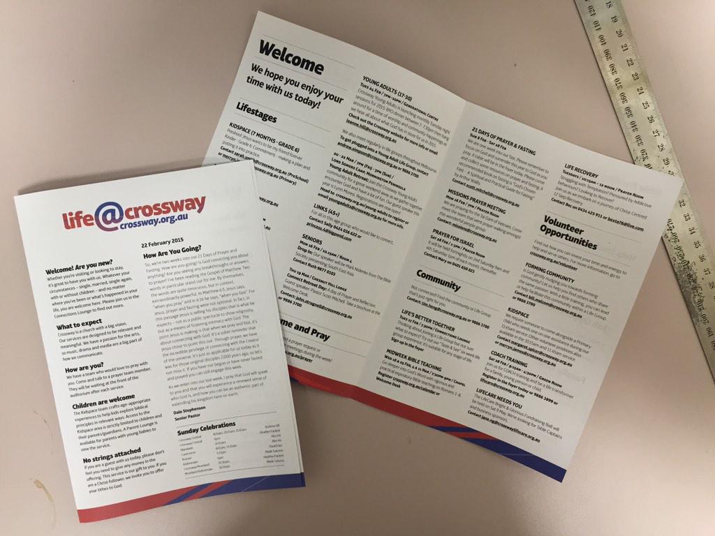
Here is the first page from a church bulletin that homes in on visitor experience. They also left generous amounts of room for the margins and still managed to include a lot of graphics and information.

Here’s a template for a church bulletin that tells the reader a lot of information in a minimal design. If your church has a lot going on, this could be a good way to fit it all in the bulletin while still drawing their attention to specific information. Since most churches don’t have daily services or events, we would recommend swapping out some of those for the other features we listed above.

This bulletin is a good fit for a more traditional congregation, but there is something any church can take away from the content. It’s easy to follow and directs the visitor to exactly what they need. Having clear, easy pathways for visitors is key, and a great way to utilize your bulletin.

While the design might be a little busy, the clearly marked sections make this church bulletin easy to navigate. Using the monthly sermon series as a graphic is a good move if you are ok printing new bulletins each month. Keeping everything updated and current is a must. No one wants to read about last month’s sermon or events. Keep it updated and keep your members excited!
Over to you
Implement these principles into your church bulletin to maximize engagement, first-time visitor connection, and member buy-in during the church service.
When you find a way to weave these practices into your church service preparation, you will likely discover that people are more attentive, more eager to participate, and more present during and after the church service.
When people know where they are going and why, they are unstoppable. When they are told to sit down for 90 minutes and be quiet, that’s a tough sell. By maximizing the utility of your church bulletin, you help your congregants not only to feel more comfortable in your church service, but also map them straight to the gold.
Sign Up for Product Updates

Your church service is gold.
And your church bulletin is the map.
Simply being in a church service is like a pirate simply being on an island. It’s nice to have a treasure map.
But here’s the thing about church bulletins: oftentimes, they end up unopened, unused, and in one of the trash cans in your foyer. Avoid the dumpster by following these rules to make your best church bulletin yet. We’ll round it out with real-world examples that you can learn from. Let’s dive in!
Here, we’ll share the 7-steps you can take to creating a must-read church bulletin, including:
- A table of contents
- An order of servicer
- Engagement hooks
- Margin
- Simplicity
- Participation cues
- One-click digital accessibility
- Examples of great church bulletins
Let’s get started!
1. A table of contents
This is not the order of service, but rather the table of contents for the entire church bulletin. It should have large margins and be clearly readable, with short, accurate labels that describe each section clearly, but with minimal detail.
This table of contents will list every new section of your church bulletin, but not every subsection. For example, if you have announcements about youth that include Sunday School, youth group activities, confirmation, and high school small groups, don’t list all of those subcategories on the table of contents. Simply call it “Youth” people will be able to easily navigate to the appropriate section. If they can’t, then you’re putting too much in your bulletin.
2. An order of service
The first element in your bulletin should be an order of service. This will list every event item in your service, as well as any information to help people act on a list item, such as reaching out to a youth coordinator after a church announcement, etc.
This order of service should include the words of prayers you pray that you expect people to know, as well as words to songs you sing that you expect people to sing along to — that is, unless they are projected on a screen.
3. Engagement hooks
Engagement hooks are bits of information that enable people to become part of your church very easily. This would include the names and contact information of people in the church office, their contact information, new event information, and an introductory letter or video link from the pastor.
4. Margin
It’s very tempting to squeeze the margins of your bulletin tight, you’re sometimes printing off the page. We think: “The more information, the better.” But the truth is often contrary to this. People like to have information distilled for them so that they don’t have to do as much work in getting the gist of what’s going on.
Leave a lot of white space on the page, and condense the elements to the center of the page as much as possible. This will attract the eye to what’s there, and act as a center of gravity for each attendee while they participate in the service.
5. Simplicity
Most people use their bulletins for one or two things. Don’t try to make everyone happy with the bulletin. Make it usable, declutter it of ads for events and contact information, and make it about the experience of the service itself. Utilize spare space to maximize focus on the church experience, rather than distract with what comes after the church experience.
Keep it simple—and, as an initial filter, keep it useful for the present moment.
6. Participation cues
You should include participation clues as to when people should rise, sit, speak, be silent, kneel, and stand. This helps new visitors to actively participate in the service, and it allows the dynamic use of alternative versions of your service that people won’t have memorized, but can still follow by cue.
7. One-click digital accessibility
The most important thing you can do to increase the effectiveness of your bulletin is to make it digital. But it’s more important than that. You can’t just put the PDF on your church website. You have to put it on your church app that you’re encouraging people to actively use as a means of messaging, planning, consuming digital media from the church, and registering for new events.
When your members can navigate through your church bulletin as easily as they can navigate Spotify on iTunes, you are operating at peak, Premium Bulletin energy.
8. Examples of great church bulletins
Pictures Worth a Thousand Words
Now that we’ve told you how to have the best church bulletin, we want to show you. Let’s take a look at a few examples and see how they get it right.
This bulletin does a great job telling the congregant what to expect in this service. You know exactly what is happening, who is doing it, and what will come next. The easy-to-find contact information helps members and visitors feel welcome to reach out if they need more information. Their engagement hooks are the events they have listed, and the two different ways to serve.
Here is the first page from a church bulletin that homes in on visitor experience. They also left generous amounts of room for the margins and still managed to include a lot of graphics and information.
Here’s a template for a church bulletin that tells the reader a lot of information in a minimal design. If your church has a lot going on, this could be a good way to fit it all in the bulletin while still drawing their attention to specific information. Since most churches don’t have daily services or events, we would recommend swapping out some of those for the other features we listed above.
This bulletin is a good fit for a more traditional congregation, but there is something any church can take away from the content. It’s easy to follow and directs the visitor to exactly what they need. Having clear, easy pathways for visitors is key, and a great way to utilize your bulletin.
While the design might be a little busy, the clearly marked sections make this church bulletin easy to navigate. Using the monthly sermon series as a graphic is a good move if you are ok printing new bulletins each month. Keeping everything updated and current is a must. No one wants to read about last month’s sermon or events. Keep it updated and keep your members excited!
Over to you
Implement these principles into your church bulletin to maximize engagement, first-time visitor connection, and member buy-in during the church service.
When you find a way to weave these practices into your church service preparation, you will likely discover that people are more attentive, more eager to participate, and more present during and after the church service.
When people know where they are going and why, they are unstoppable. When they are told to sit down for 90 minutes and be quiet, that’s a tough sell. By maximizing the utility of your church bulletin, you help your congregants not only to feel more comfortable in your church service, but also map them straight to the gold.
podcast transcript
Your church service is gold.
And your church bulletin is the map.
Simply being in a church service is like a pirate simply being on an island. It’s nice to have a treasure map.
But here’s the thing about church bulletins: oftentimes, they end up unopened, unused, and in one of the trash cans in your foyer. Avoid the dumpster by following these rules to make your best church bulletin yet. We’ll round it out with real-world examples that you can learn from. Let’s dive in!
Here, we’ll share the 7-steps you can take to creating a must-read church bulletin, including:
- A table of contents
- An order of servicer
- Engagement hooks
- Margin
- Simplicity
- Participation cues
- One-click digital accessibility
- Examples of great church bulletins
Let’s get started!
1. A table of contents
This is not the order of service, but rather the table of contents for the entire church bulletin. It should have large margins and be clearly readable, with short, accurate labels that describe each section clearly, but with minimal detail.
This table of contents will list every new section of your church bulletin, but not every subsection. For example, if you have announcements about youth that include Sunday School, youth group activities, confirmation, and high school small groups, don’t list all of those subcategories on the table of contents. Simply call it “Youth” people will be able to easily navigate to the appropriate section. If they can’t, then you’re putting too much in your bulletin.
2. An order of service
The first element in your bulletin should be an order of service. This will list every event item in your service, as well as any information to help people act on a list item, such as reaching out to a youth coordinator after a church announcement, etc.
This order of service should include the words of prayers you pray that you expect people to know, as well as words to songs you sing that you expect people to sing along to — that is, unless they are projected on a screen.
3. Engagement hooks
Engagement hooks are bits of information that enable people to become part of your church very easily. This would include the names and contact information of people in the church office, their contact information, new event information, and an introductory letter or video link from the pastor.
4. Margin
It’s very tempting to squeeze the margins of your bulletin tight, you’re sometimes printing off the page. We think: “The more information, the better.” But the truth is often contrary to this. People like to have information distilled for them so that they don’t have to do as much work in getting the gist of what’s going on.
Leave a lot of white space on the page, and condense the elements to the center of the page as much as possible. This will attract the eye to what’s there, and act as a center of gravity for each attendee while they participate in the service.
5. Simplicity
Most people use their bulletins for one or two things. Don’t try to make everyone happy with the bulletin. Make it usable, declutter it of ads for events and contact information, and make it about the experience of the service itself. Utilize spare space to maximize focus on the church experience, rather than distract with what comes after the church experience.
Keep it simple—and, as an initial filter, keep it useful for the present moment.
6. Participation cues
You should include participation clues as to when people should rise, sit, speak, be silent, kneel, and stand. This helps new visitors to actively participate in the service, and it allows the dynamic use of alternative versions of your service that people won’t have memorized, but can still follow by cue.
7. One-click digital accessibility
The most important thing you can do to increase the effectiveness of your bulletin is to make it digital. But it’s more important than that. You can’t just put the PDF on your church website. You have to put it on your church app that you’re encouraging people to actively use as a means of messaging, planning, consuming digital media from the church, and registering for new events.
When your members can navigate through your church bulletin as easily as they can navigate Spotify on iTunes, you are operating at peak, Premium Bulletin energy.
8. Examples of great church bulletins
Pictures Worth a Thousand Words
Now that we’ve told you how to have the best church bulletin, we want to show you. Let’s take a look at a few examples and see how they get it right.
This bulletin does a great job telling the congregant what to expect in this service. You know exactly what is happening, who is doing it, and what will come next. The easy-to-find contact information helps members and visitors feel welcome to reach out if they need more information. Their engagement hooks are the events they have listed, and the two different ways to serve.
Here is the first page from a church bulletin that homes in on visitor experience. They also left generous amounts of room for the margins and still managed to include a lot of graphics and information.
Here’s a template for a church bulletin that tells the reader a lot of information in a minimal design. If your church has a lot going on, this could be a good way to fit it all in the bulletin while still drawing their attention to specific information. Since most churches don’t have daily services or events, we would recommend swapping out some of those for the other features we listed above.
This bulletin is a good fit for a more traditional congregation, but there is something any church can take away from the content. It’s easy to follow and directs the visitor to exactly what they need. Having clear, easy pathways for visitors is key, and a great way to utilize your bulletin.
While the design might be a little busy, the clearly marked sections make this church bulletin easy to navigate. Using the monthly sermon series as a graphic is a good move if you are ok printing new bulletins each month. Keeping everything updated and current is a must. No one wants to read about last month’s sermon or events. Keep it updated and keep your members excited!
Over to you
Implement these principles into your church bulletin to maximize engagement, first-time visitor connection, and member buy-in during the church service.
When you find a way to weave these practices into your church service preparation, you will likely discover that people are more attentive, more eager to participate, and more present during and after the church service.
When people know where they are going and why, they are unstoppable. When they are told to sit down for 90 minutes and be quiet, that’s a tough sell. By maximizing the utility of your church bulletin, you help your congregants not only to feel more comfortable in your church service, but also map them straight to the gold.
VIDEO transcript
Your church service is gold.
And your church bulletin is the map.
Simply being in a church service is like a pirate simply being on an island. It’s nice to have a treasure map.
But here’s the thing about church bulletins: oftentimes, they end up unopened, unused, and in one of the trash cans in your foyer. Avoid the dumpster by following these rules to make your best church bulletin yet. We’ll round it out with real-world examples that you can learn from. Let’s dive in!
Here, we’ll share the 7-steps you can take to creating a must-read church bulletin, including:
- A table of contents
- An order of servicer
- Engagement hooks
- Margin
- Simplicity
- Participation cues
- One-click digital accessibility
- Examples of great church bulletins
Let’s get started!
1. A table of contents
This is not the order of service, but rather the table of contents for the entire church bulletin. It should have large margins and be clearly readable, with short, accurate labels that describe each section clearly, but with minimal detail.
This table of contents will list every new section of your church bulletin, but not every subsection. For example, if you have announcements about youth that include Sunday School, youth group activities, confirmation, and high school small groups, don’t list all of those subcategories on the table of contents. Simply call it “Youth” people will be able to easily navigate to the appropriate section. If they can’t, then you’re putting too much in your bulletin.
2. An order of service
The first element in your bulletin should be an order of service. This will list every event item in your service, as well as any information to help people act on a list item, such as reaching out to a youth coordinator after a church announcement, etc.
This order of service should include the words of prayers you pray that you expect people to know, as well as words to songs you sing that you expect people to sing along to — that is, unless they are projected on a screen.
3. Engagement hooks
Engagement hooks are bits of information that enable people to become part of your church very easily. This would include the names and contact information of people in the church office, their contact information, new event information, and an introductory letter or video link from the pastor.
4. Margin
It’s very tempting to squeeze the margins of your bulletin tight, you’re sometimes printing off the page. We think: “The more information, the better.” But the truth is often contrary to this. People like to have information distilled for them so that they don’t have to do as much work in getting the gist of what’s going on.
Leave a lot of white space on the page, and condense the elements to the center of the page as much as possible. This will attract the eye to what’s there, and act as a center of gravity for each attendee while they participate in the service.
5. Simplicity
Most people use their bulletins for one or two things. Don’t try to make everyone happy with the bulletin. Make it usable, declutter it of ads for events and contact information, and make it about the experience of the service itself. Utilize spare space to maximize focus on the church experience, rather than distract with what comes after the church experience.
Keep it simple—and, as an initial filter, keep it useful for the present moment.
6. Participation cues
You should include participation clues as to when people should rise, sit, speak, be silent, kneel, and stand. This helps new visitors to actively participate in the service, and it allows the dynamic use of alternative versions of your service that people won’t have memorized, but can still follow by cue.
7. One-click digital accessibility
The most important thing you can do to increase the effectiveness of your bulletin is to make it digital. But it’s more important than that. You can’t just put the PDF on your church website. You have to put it on your church app that you’re encouraging people to actively use as a means of messaging, planning, consuming digital media from the church, and registering for new events.
When your members can navigate through your church bulletin as easily as they can navigate Spotify on iTunes, you are operating at peak, Premium Bulletin energy.
8. Examples of great church bulletins
Pictures Worth a Thousand Words
Now that we’ve told you how to have the best church bulletin, we want to show you. Let’s take a look at a few examples and see how they get it right.
This bulletin does a great job telling the congregant what to expect in this service. You know exactly what is happening, who is doing it, and what will come next. The easy-to-find contact information helps members and visitors feel welcome to reach out if they need more information. Their engagement hooks are the events they have listed, and the two different ways to serve.
Here is the first page from a church bulletin that homes in on visitor experience. They also left generous amounts of room for the margins and still managed to include a lot of graphics and information.
Here’s a template for a church bulletin that tells the reader a lot of information in a minimal design. If your church has a lot going on, this could be a good way to fit it all in the bulletin while still drawing their attention to specific information. Since most churches don’t have daily services or events, we would recommend swapping out some of those for the other features we listed above.
This bulletin is a good fit for a more traditional congregation, but there is something any church can take away from the content. It’s easy to follow and directs the visitor to exactly what they need. Having clear, easy pathways for visitors is key, and a great way to utilize your bulletin.
While the design might be a little busy, the clearly marked sections make this church bulletin easy to navigate. Using the monthly sermon series as a graphic is a good move if you are ok printing new bulletins each month. Keeping everything updated and current is a must. No one wants to read about last month’s sermon or events. Keep it updated and keep your members excited!
Over to you
Implement these principles into your church bulletin to maximize engagement, first-time visitor connection, and member buy-in during the church service.
When you find a way to weave these practices into your church service preparation, you will likely discover that people are more attentive, more eager to participate, and more present during and after the church service.
When people know where they are going and why, they are unstoppable. When they are told to sit down for 90 minutes and be quiet, that’s a tough sell. By maximizing the utility of your church bulletin, you help your congregants not only to feel more comfortable in your church service, but also map them straight to the gold.
Sign Up for Product Updates

You Might Also Like
More Resources

From increasing giving, managing your congregation, and engaging your church, our collection of resources will keep you up-to-date on the latest church and ministry trends.
Free Resources
.jpg)


.jpg)
.jpg)
