


[Product Update] Get a Megachurch App WITHOUT Spending Megabucks
See how you can create a slick, fast, and easy-to-use experience with your church app.
![[Product Update] Get a Megachurch App WITHOUT Spending Megabucks](https://cdn.prod.website-files.com/5f6b9a421d5a61e1d0cd9e3d/5f8e79ff25df891d02fce422_5c4b2fa8f3fbf42641bf5f8d_Woman_iPhone%2520X_Cafe.png)
Good experiences with your church's app are everything.
After scrolling through Facebook, playing Fortnite, or buying something on Wish, people expect your church app to be slick, fast, and easy-to-use.
As a church leader, it’s hard to meet these expectations.
And to add insult to injury, you look at apps from Life.Church and Elevation Church and you know that you don’t have the money or staff to make something similar.
Before you fall into a pit of despair, hang tight.
Things are about to change for you. 🙂
We just rolled out some sweet updates you’re going to love.
Let me shoot you straight:
You can now get a megachurch app without spending megabucks.
I know you’re a person of action, so I’ll spare you the small talk.
So let me show you what I’m talking about instead.
New layout with horizontally scrolling cards
Check out this example from Church of the Westside.
At first, you’ll notice an attention-grabbing banner at the top.

This banner is optional.
But it works well to engage your church app users with whatever you’re promoting.
Next, you’ll see individual sections that include horizontally scrolling cards:
.gif)
This new layout makes it super easy for people to use your church’s app.
Here’s how:
- Emphasizes important sections
- Makes it easy for people to find their way around
- Reduces unwanted clutter
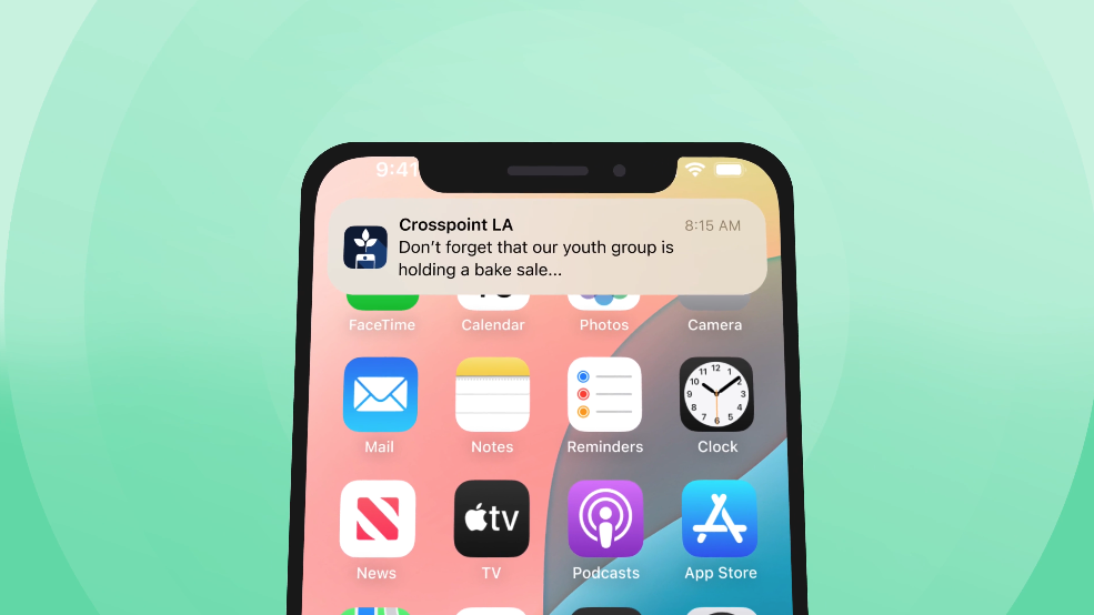
Talking about clutter, our new layout makes it easy to simplify your church app.
One way you can now reduce your church app’s clutter is by reducing the number of tabs at the bottom.
Check this out:

When you click on “Home,” you will be taken back to the main page. Now, when you click on “Newsfeed,” you’ll be able to scroll through your church’s social media accounts.
Let me show you:
.gif)
For Church of the Westside, their newsfeed pulls in updates from their social media accounts, as well as their push notifications. This change makes it significantly easier for your church to stay up to date with you online.
Smooth, reliable experience
Do you want to test someone’s faith?
Provide a church app that’s slow, freezes, or crashes.
Building an inefficient app may not (really) tempt someone to walk away from your church. But it will entice them to uninstall your app and never use it again.
The latest updates we made include beautiful, rich imagery.
Usually, these types of images will slow down your app or website, like, way down.
But that’s not the case with our church app.
I don’t want to bore you with the details.
But here’s what you can expect:
A smooth, reliable, and fast experience for your church app users.
To make sure the images and content of your church app load fast, we developed our app in such a way that it won’t cause someone’s phone to crash or gobble up loads of data.
Update to slide out cards
Here’s one last nice touch we added:
You can completely customize the cards in the slide-out menu and link to wherever you want.
Take a look:
.gif)
Previously, you couldn’t customize the image and you were limited to the links you could include.
You now have the freedom to customize these cards any way you see fit.
Video tutorial of new layout
Like to see a step-by-step walkthrough of every new update?
Check out this video demonstration:
Ready to launch your new app?

Contact a specialist today to learn more.
Have a church app with Tithe.ly?
Then send us an email, and a member of our team will walk you through the changes.
Sign Up for Product Updates

Jesse Wisnewski is the founder of EverRaise, an AI engagement team that helps relationship-driven organizations keep more supporters and raise more money. His work has been featured in Forbes, CNBC Make It, The Muse, Observer, and other outlets. He holds a master’s degree from Gordon-Conwell Theological Seminary and a marketing degree from Marshall University. He lives in Charleston, West Virginia, with his family.
Good experiences with your church's app are everything.
After scrolling through Facebook, playing Fortnite, or buying something on Wish, people expect your church app to be slick, fast, and easy-to-use.
As a church leader, it’s hard to meet these expectations.
And to add insult to injury, you look at apps from Life.Church and Elevation Church and you know that you don’t have the money or staff to make something similar.
Before you fall into a pit of despair, hang tight.
Things are about to change for you. 🙂
We just rolled out some sweet updates you’re going to love.
Let me shoot you straight:
You can now get a megachurch app without spending megabucks.
I know you’re a person of action, so I’ll spare you the small talk.
So let me show you what I’m talking about instead.
New layout with horizontally scrolling cards
Check out this example from Church of the Westside.
At first, you’ll notice an attention-grabbing banner at the top.
This banner is optional.
But it works well to engage your church app users with whatever you’re promoting.
Next, you’ll see individual sections that include horizontally scrolling cards:
This new layout makes it super easy for people to use your church’s app.
Here’s how:
- Emphasizes important sections
- Makes it easy for people to find their way around
- Reduces unwanted clutter
Talking about clutter, our new layout makes it easy to simplify your church app.
One way you can now reduce your church app’s clutter is by reducing the number of tabs at the bottom.
Check this out:
When you click on “Home,” you will be taken back to the main page. Now, when you click on “Newsfeed,” you’ll be able to scroll through your church’s social media accounts.
Let me show you:
For Church of the Westside, their newsfeed pulls in updates from their social media accounts, as well as their push notifications. This change makes it significantly easier for your church to stay up to date with you online.
Smooth, reliable experience
Do you want to test someone’s faith?
Provide a church app that’s slow, freezes, or crashes.
Building an inefficient app may not (really) tempt someone to walk away from your church. But it will entice them to uninstall your app and never use it again.
The latest updates we made include beautiful, rich imagery.
Usually, these types of images will slow down your app or website, like, way down.
But that’s not the case with our church app.
I don’t want to bore you with the details.
But here’s what you can expect:
A smooth, reliable, and fast experience for your church app users.
To make sure the images and content of your church app load fast, we developed our app in such a way that it won’t cause someone’s phone to crash or gobble up loads of data.
Update to slide out cards
Here’s one last nice touch we added:
You can completely customize the cards in the slide-out menu and link to wherever you want.
Take a look:
Previously, you couldn’t customize the image and you were limited to the links you could include.
You now have the freedom to customize these cards any way you see fit.
Video tutorial of new layout
Like to see a step-by-step walkthrough of every new update?
Check out this video demonstration:
Ready to launch your new app?
Contact a specialist today to learn more.
Have a church app with Tithe.ly?
Then send us an email, and a member of our team will walk you through the changes.
podcast transcript
Jesse Wisnewski is the founder of EverRaise, an AI engagement team that helps relationship-driven organizations keep more supporters and raise more money. His work has been featured in Forbes, CNBC Make It, The Muse, Observer, and other outlets. He holds a master’s degree from Gordon-Conwell Theological Seminary and a marketing degree from Marshall University. He lives in Charleston, West Virginia, with his family.
Good experiences with your church's app are everything.
After scrolling through Facebook, playing Fortnite, or buying something on Wish, people expect your church app to be slick, fast, and easy-to-use.
As a church leader, it’s hard to meet these expectations.
And to add insult to injury, you look at apps from Life.Church and Elevation Church and you know that you don’t have the money or staff to make something similar.
Before you fall into a pit of despair, hang tight.
Things are about to change for you. 🙂
We just rolled out some sweet updates you’re going to love.
Let me shoot you straight:
You can now get a megachurch app without spending megabucks.
I know you’re a person of action, so I’ll spare you the small talk.
So let me show you what I’m talking about instead.
New layout with horizontally scrolling cards
Check out this example from Church of the Westside.
At first, you’ll notice an attention-grabbing banner at the top.
This banner is optional.
But it works well to engage your church app users with whatever you’re promoting.
Next, you’ll see individual sections that include horizontally scrolling cards:
This new layout makes it super easy for people to use your church’s app.
Here’s how:
- Emphasizes important sections
- Makes it easy for people to find their way around
- Reduces unwanted clutter
Talking about clutter, our new layout makes it easy to simplify your church app.
One way you can now reduce your church app’s clutter is by reducing the number of tabs at the bottom.
Check this out:
When you click on “Home,” you will be taken back to the main page. Now, when you click on “Newsfeed,” you’ll be able to scroll through your church’s social media accounts.
Let me show you:
For Church of the Westside, their newsfeed pulls in updates from their social media accounts, as well as their push notifications. This change makes it significantly easier for your church to stay up to date with you online.
Smooth, reliable experience
Do you want to test someone’s faith?
Provide a church app that’s slow, freezes, or crashes.
Building an inefficient app may not (really) tempt someone to walk away from your church. But it will entice them to uninstall your app and never use it again.
The latest updates we made include beautiful, rich imagery.
Usually, these types of images will slow down your app or website, like, way down.
But that’s not the case with our church app.
I don’t want to bore you with the details.
But here’s what you can expect:
A smooth, reliable, and fast experience for your church app users.
To make sure the images and content of your church app load fast, we developed our app in such a way that it won’t cause someone’s phone to crash or gobble up loads of data.
Update to slide out cards
Here’s one last nice touch we added:
You can completely customize the cards in the slide-out menu and link to wherever you want.
Take a look:
Previously, you couldn’t customize the image and you were limited to the links you could include.
You now have the freedom to customize these cards any way you see fit.
Video tutorial of new layout
Like to see a step-by-step walkthrough of every new update?
Check out this video demonstration:
Ready to launch your new app?
Contact a specialist today to learn more.
Have a church app with Tithe.ly?
Then send us an email, and a member of our team will walk you through the changes.
VIDEO transcript
Good experiences with your church's app are everything.
After scrolling through Facebook, playing Fortnite, or buying something on Wish, people expect your church app to be slick, fast, and easy-to-use.
As a church leader, it’s hard to meet these expectations.
And to add insult to injury, you look at apps from Life.Church and Elevation Church and you know that you don’t have the money or staff to make something similar.
Before you fall into a pit of despair, hang tight.
Things are about to change for you. 🙂
We just rolled out some sweet updates you’re going to love.
Let me shoot you straight:
You can now get a megachurch app without spending megabucks.
I know you’re a person of action, so I’ll spare you the small talk.
So let me show you what I’m talking about instead.
New layout with horizontally scrolling cards
Check out this example from Church of the Westside.
At first, you’ll notice an attention-grabbing banner at the top.
This banner is optional.
But it works well to engage your church app users with whatever you’re promoting.
Next, you’ll see individual sections that include horizontally scrolling cards:
This new layout makes it super easy for people to use your church’s app.
Here’s how:
- Emphasizes important sections
- Makes it easy for people to find their way around
- Reduces unwanted clutter
Talking about clutter, our new layout makes it easy to simplify your church app.
One way you can now reduce your church app’s clutter is by reducing the number of tabs at the bottom.
Check this out:
When you click on “Home,” you will be taken back to the main page. Now, when you click on “Newsfeed,” you’ll be able to scroll through your church’s social media accounts.
Let me show you:
For Church of the Westside, their newsfeed pulls in updates from their social media accounts, as well as their push notifications. This change makes it significantly easier for your church to stay up to date with you online.
Smooth, reliable experience
Do you want to test someone’s faith?
Provide a church app that’s slow, freezes, or crashes.
Building an inefficient app may not (really) tempt someone to walk away from your church. But it will entice them to uninstall your app and never use it again.
The latest updates we made include beautiful, rich imagery.
Usually, these types of images will slow down your app or website, like, way down.
But that’s not the case with our church app.
I don’t want to bore you with the details.
But here’s what you can expect:
A smooth, reliable, and fast experience for your church app users.
To make sure the images and content of your church app load fast, we developed our app in such a way that it won’t cause someone’s phone to crash or gobble up loads of data.
Update to slide out cards
Here’s one last nice touch we added:
You can completely customize the cards in the slide-out menu and link to wherever you want.
Take a look:
Previously, you couldn’t customize the image and you were limited to the links you could include.
You now have the freedom to customize these cards any way you see fit.
Video tutorial of new layout
Like to see a step-by-step walkthrough of every new update?
Check out this video demonstration:
Ready to launch your new app?
Contact a specialist today to learn more.
Have a church app with Tithe.ly?
Then send us an email, and a member of our team will walk you through the changes.
Sign Up for Product Updates
Jesse Wisnewski is the founder of EverRaise, an AI engagement team that helps relationship-driven organizations keep more supporters and raise more money. His work has been featured in Forbes, CNBC Make It, The Muse, Observer, and other outlets. He holds a master’s degree from Gordon-Conwell Theological Seminary and a marketing degree from Marshall University. He lives in Charleston, West Virginia, with his family.

You Might Also Like
More Resources

From increasing giving, managing your congregation, and engaging your church, our collection of resources will keep you up-to-date on the latest church and ministry trends.
Free Resources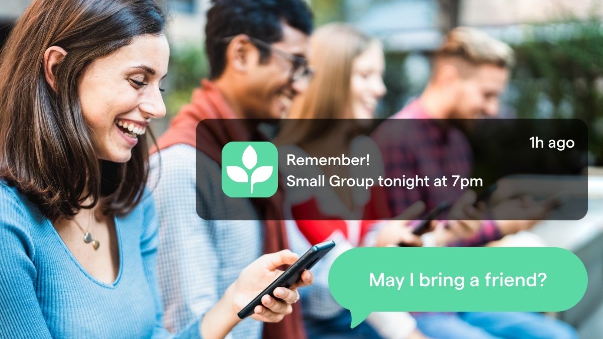


-p-1080.png)
.jpg)
