


Introducing Slide-Out Menus: The NEW, Slicker Version of Your Church App
You'll love the new slide-out menu in our church app.

At Tithe.ly, we have a need for speed.
We understand that time is precious, and that people don’t want to fumble their way through the apps they use on their smartphone. So we made some new slick updates to our church app that will not only save you time. But look ah-mazing, too.
Let me show you what I’m talking about.
New facelift
There’s more to designing software than making it look pretty. It has to function, too. But it sure doesn’t hurt to make things look beautiful.
Here’s the new design our team developed for our church app:

Isn’t this a beaut?
Super slick navigation
When traveling, here’s a bit of advice I’ve passed on to my children: The shortest distance between two places is a straight line.
You’re probably thinking:
What does this have to do with my church app?
Well, everything for this latest update.
To help you quickly jump from place-to-place inside your church app, we made the navigation simple and intuitive.
You don’t have to click on seven different options to find what you’re looking for. You can quickly access the core areas in your app, including:
- Notifications
- Settings
- Giving
- Sharing
You know what?
That’s NOT all!
(Sorry, I couldn’t resist sounding like a salesperson.)
We added a menu button in the top left-hand corner in your app.

Like a helicopter parent, the menu button will follow you around everywhere you go in the app.
After you click on one option, say “Register” in the above image, you’ll be able to go back to the main menu by clicking on the menu button.
You see?
We made it simple for you to quickly get to where you need to go in your app.
But ladies and gentlemen, we not only added this new menu and menu bar.
(Okay, I’ll stop with the cheesy sales techniques.)
We also included beautiful new menu cards you can use to …
- Help people to use your app
- Highlight sections in your menu
- Navigate your app in a new way
- Create a beautiful experience for your app users
Here’s a glimpse of what I’m talking about from North Coast Church:
I know this new navigation can be hard to visualize, so here’s how it looks in action:
Easily share your church app
Do you want to know what’s easy?
From within your church app, it’s now super easy for you to…
- Share your App Download Link
- Share your sermons
- Share your church events
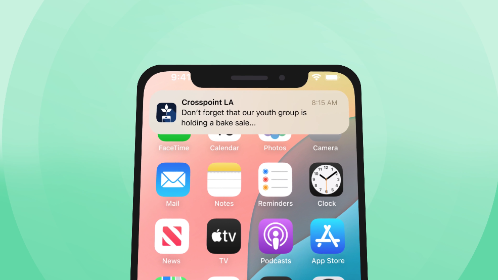
Check out this example from Seattle Church of Christ:

Do you like the image in the Facebook post above? It’s auto-generated on iOS from within your app, which is pretty awesome.
And finally ...
If you need to find your church or search for a new church, it’s now as easy as the push of a button.

This means you can go from feeling lost in your church app …
… to experiencing the bliss of finding what you’re looking for.
Ready to get started for FREE?

Sign Up for Product Updates

Jesse Wisnewski is the founder of EverRaise, an AI engagement team that helps relationship-driven organizations keep more supporters and raise more money. His work has been featured in Forbes, CNBC Make It, The Muse, Observer, and other outlets. He holds a master’s degree from Gordon-Conwell Theological Seminary and a marketing degree from Marshall University. He lives in Charleston, West Virginia, with his family.
At Tithe.ly, we have a need for speed.
We understand that time is precious, and that people don’t want to fumble their way through the apps they use on their smartphone. So we made some new slick updates to our church app that will not only save you time. But look ah-mazing, too.
Let me show you what I’m talking about.
New facelift
There’s more to designing software than making it look pretty. It has to function, too. But it sure doesn’t hurt to make things look beautiful.
Here’s the new design our team developed for our church app:
Isn’t this a beaut?
Super slick navigation
When traveling, here’s a bit of advice I’ve passed on to my children: The shortest distance between two places is a straight line.
You’re probably thinking:
What does this have to do with my church app?
Well, everything for this latest update.
To help you quickly jump from place-to-place inside your church app, we made the navigation simple and intuitive.
You don’t have to click on seven different options to find what you’re looking for. You can quickly access the core areas in your app, including:
- Notifications
- Settings
- Giving
- Sharing
You know what?
That’s NOT all!
(Sorry, I couldn’t resist sounding like a salesperson.)
We added a menu button in the top left-hand corner in your app.
Like a helicopter parent, the menu button will follow you around everywhere you go in the app.
After you click on one option, say “Register” in the above image, you’ll be able to go back to the main menu by clicking on the menu button.
You see?
We made it simple for you to quickly get to where you need to go in your app.
But ladies and gentlemen, we not only added this new menu and menu bar.
(Okay, I’ll stop with the cheesy sales techniques.)
We also included beautiful new menu cards you can use to …
- Help people to use your app
- Highlight sections in your menu
- Navigate your app in a new way
- Create a beautiful experience for your app users
Here’s a glimpse of what I’m talking about from North Coast Church:
I know this new navigation can be hard to visualize, so here’s how it looks in action:
Easily share your church app
Do you want to know what’s easy?
From within your church app, it’s now super easy for you to…
- Share your App Download Link
- Share your sermons
- Share your church events
Check out this example from Seattle Church of Christ:
Do you like the image in the Facebook post above? It’s auto-generated on iOS from within your app, which is pretty awesome.
And finally ...
If you need to find your church or search for a new church, it’s now as easy as the push of a button.
This means you can go from feeling lost in your church app …
… to experiencing the bliss of finding what you’re looking for.
Ready to get started for FREE?
podcast transcript
Jesse Wisnewski is the founder of EverRaise, an AI engagement team that helps relationship-driven organizations keep more supporters and raise more money. His work has been featured in Forbes, CNBC Make It, The Muse, Observer, and other outlets. He holds a master’s degree from Gordon-Conwell Theological Seminary and a marketing degree from Marshall University. He lives in Charleston, West Virginia, with his family.
At Tithe.ly, we have a need for speed.
We understand that time is precious, and that people don’t want to fumble their way through the apps they use on their smartphone. So we made some new slick updates to our church app that will not only save you time. But look ah-mazing, too.
Let me show you what I’m talking about.
New facelift
There’s more to designing software than making it look pretty. It has to function, too. But it sure doesn’t hurt to make things look beautiful.
Here’s the new design our team developed for our church app:
Isn’t this a beaut?
Super slick navigation
When traveling, here’s a bit of advice I’ve passed on to my children: The shortest distance between two places is a straight line.
You’re probably thinking:
What does this have to do with my church app?
Well, everything for this latest update.
To help you quickly jump from place-to-place inside your church app, we made the navigation simple and intuitive.
You don’t have to click on seven different options to find what you’re looking for. You can quickly access the core areas in your app, including:
- Notifications
- Settings
- Giving
- Sharing
You know what?
That’s NOT all!
(Sorry, I couldn’t resist sounding like a salesperson.)
We added a menu button in the top left-hand corner in your app.
Like a helicopter parent, the menu button will follow you around everywhere you go in the app.
After you click on one option, say “Register” in the above image, you’ll be able to go back to the main menu by clicking on the menu button.
You see?
We made it simple for you to quickly get to where you need to go in your app.
But ladies and gentlemen, we not only added this new menu and menu bar.
(Okay, I’ll stop with the cheesy sales techniques.)
We also included beautiful new menu cards you can use to …
- Help people to use your app
- Highlight sections in your menu
- Navigate your app in a new way
- Create a beautiful experience for your app users
Here’s a glimpse of what I’m talking about from North Coast Church:
I know this new navigation can be hard to visualize, so here’s how it looks in action:
Easily share your church app
Do you want to know what’s easy?
From within your church app, it’s now super easy for you to…
- Share your App Download Link
- Share your sermons
- Share your church events
Check out this example from Seattle Church of Christ:
Do you like the image in the Facebook post above? It’s auto-generated on iOS from within your app, which is pretty awesome.
And finally ...
If you need to find your church or search for a new church, it’s now as easy as the push of a button.
This means you can go from feeling lost in your church app …
… to experiencing the bliss of finding what you’re looking for.
Ready to get started for FREE?
VIDEO transcript
At Tithe.ly, we have a need for speed.
We understand that time is precious, and that people don’t want to fumble their way through the apps they use on their smartphone. So we made some new slick updates to our church app that will not only save you time. But look ah-mazing, too.
Let me show you what I’m talking about.
New facelift
There’s more to designing software than making it look pretty. It has to function, too. But it sure doesn’t hurt to make things look beautiful.
Here’s the new design our team developed for our church app:
Isn’t this a beaut?
Super slick navigation
When traveling, here’s a bit of advice I’ve passed on to my children: The shortest distance between two places is a straight line.
You’re probably thinking:
What does this have to do with my church app?
Well, everything for this latest update.
To help you quickly jump from place-to-place inside your church app, we made the navigation simple and intuitive.
You don’t have to click on seven different options to find what you’re looking for. You can quickly access the core areas in your app, including:
- Notifications
- Settings
- Giving
- Sharing
You know what?
That’s NOT all!
(Sorry, I couldn’t resist sounding like a salesperson.)
We added a menu button in the top left-hand corner in your app.
Like a helicopter parent, the menu button will follow you around everywhere you go in the app.
After you click on one option, say “Register” in the above image, you’ll be able to go back to the main menu by clicking on the menu button.
You see?
We made it simple for you to quickly get to where you need to go in your app.
But ladies and gentlemen, we not only added this new menu and menu bar.
(Okay, I’ll stop with the cheesy sales techniques.)
We also included beautiful new menu cards you can use to …
- Help people to use your app
- Highlight sections in your menu
- Navigate your app in a new way
- Create a beautiful experience for your app users
Here’s a glimpse of what I’m talking about from North Coast Church:
I know this new navigation can be hard to visualize, so here’s how it looks in action:
Easily share your church app
Do you want to know what’s easy?
From within your church app, it’s now super easy for you to…
- Share your App Download Link
- Share your sermons
- Share your church events
Check out this example from Seattle Church of Christ:
Do you like the image in the Facebook post above? It’s auto-generated on iOS from within your app, which is pretty awesome.
And finally ...
If you need to find your church or search for a new church, it’s now as easy as the push of a button.
This means you can go from feeling lost in your church app …
… to experiencing the bliss of finding what you’re looking for.
Ready to get started for FREE?
Sign Up for Product Updates
Jesse Wisnewski is the founder of EverRaise, an AI engagement team that helps relationship-driven organizations keep more supporters and raise more money. His work has been featured in Forbes, CNBC Make It, The Muse, Observer, and other outlets. He holds a master’s degree from Gordon-Conwell Theological Seminary and a marketing degree from Marshall University. He lives in Charleston, West Virginia, with his family.

You Might Also Like
More Resources

From increasing giving, managing your congregation, and engaging your church, our collection of resources will keep you up-to-date on the latest church and ministry trends.
Free Resources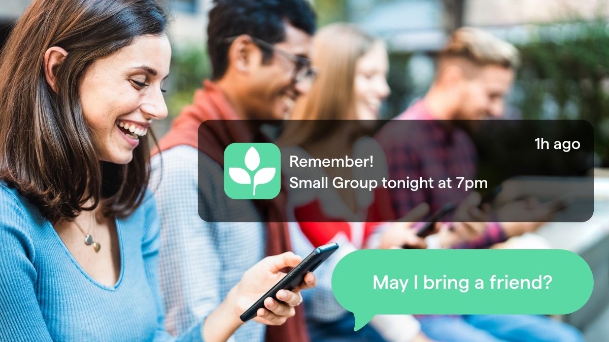


-p-1080.png)
.jpg)
